Card
Configuring the Card - Properties
- From the Build component in the left menu, under the Widgets section, drag and drop the Card widget to any blue highlighted space on the page.
-
To configure the Card widget, hover your mouse over the widget and
click
 (Edit) icon.
The Card pop-up window opens with the Properties tab open by default.
(Edit) icon.
The Card pop-up window opens with the Properties tab open by default. -
In the Card widget window, under Properties, enter or select
the required field information.
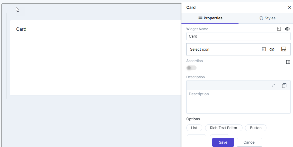
Table 1. Field descriptions for Properties Field Description Widget Name Allows you to enter the name for the card widget. Styling options available for the Widget name are:  - Allows you to align the
widget name to the left, right, center of the
widget.
- Allows you to align the
widget name to the left, right, center of the
widget.
 /
/ - Allows you to show or
hide the widget name.
- Allows you to show or
hide the widget name.
Select icon Allows you to select an icon for the widget. Styling options available for the icon are: - - Allows you to align the
icon to the left, right, or adjacent to the widget
name.
- / - Allows you to show or
hide the icon.
Accordion - Turn this toggle on or off to hide or show large volumes of content in the card widget.
- Turning the toggle on displays options to select icons to Expand and Collapse the content in the card widget.
- Click to align the Expand and
Collapse icons to the left or right of the
widget.
Description Allows you to add a description for the card widget. Options Allows you to add the following components to the card widget: - List
- Rich Text Editor
- Button
- Group
- Image.
- Click Save.
Configuring Lists in the Card Widget
-
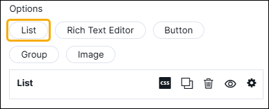
In the Card window, in the Properties tab, under
Options, click List.
The List row is displayed.
-
To expand the row and add a list, click
 (Add) icon.
A new row is displayed with the default name as List1. You can rename this by typing over the existing name.
(Add) icon.
A new row is displayed with the default name as List1. You can rename this by typing over the existing name. -
In the List1 row, to configure the list, click
 (Settings) icon, and again click the settings icon within the
list configuration.
The following options are displayed as shown in the screenshot below.
(Settings) icon, and again click the settings icon within the
list configuration.
The following options are displayed as shown in the screenshot below.- Prefix Icon
- Info Icon
- Suffix Icon
- Add link.
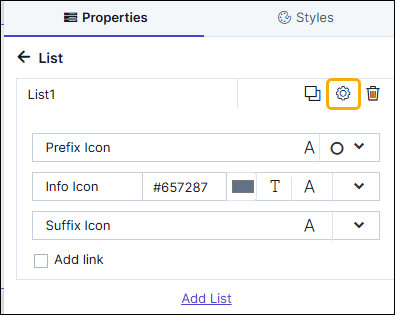
Table 2. Options descriptions Option Description Prefix Icon - To add a prefix icon next to the
list name, click
 and select the required
icon from the options available.
and select the required
icon from the options available. - To increase or decrease the size of
the prefix icon, click
 and set the icon
size.
and set the icon
size.
Info Icon - To add an Info icon next to the list
name, click and select the required
icon from the options available.
- To increase or decrease the size of
the Info icon, click and set the icon
size.
- To select a color for the info icon,
click the
 color picker
box and select the required color.
color picker
box and select the required color. - To add info text, click
 and enter the text in the
textbox.
and enter the text in the
textbox.
Suffix Icon - To add a suffix icon next to the
list name, click and select the required
icon from the options available.
- To increase or decrease the size of
the suffix icon, click and set the icon
size.
- To add a link for the list, select the Add link checkbox.
-
To hide the List row, click
(View) icon. To display it again click
(Hide) icon.
-
To delete the List row, click
 (Delete) icon.
-
To define the padding, margins, background color, and font size for the
List within the card, click
(Layout) icon.
- Once you have configured all the settings, click Save.
- To add another list, click Add List.
Configuring Rich Text Editor in the Card Widget
-
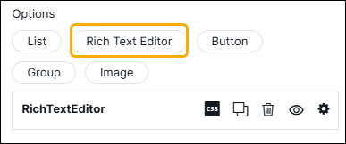
In the Card window, in the Properties tab, under
Options, click Rich Text Editor.
The List row is displayed.
-
To expand the row and add a Rich Text Editor, click
(Settings) icon
The Rich Text Editor is displayed.
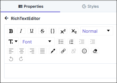 Note: For more information on the Rich Text Editor, click here.
 -
To hide the Rich Text Editor, click
(View) icon. To display it again click
(Hide) icon.
-
To delete the Rich Text Editor, click
(Delete) icon.
-
To define the padding, margins, background color, and font size for the
Rich Text Editor within the card, click
(Layout) icon.
- Once you have configured all the settings, click Save.
Configuring a Button in the Card Widget
-
In the Card window, in the Properties tab, under
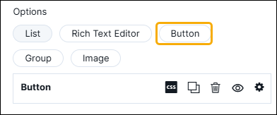
Options, click Button.
The Button row is displayed.
-
To expand the row and add a list, click
(Settings) icon.
-
In the Button1 configuration, to configure the list, click
 (Settings) icon.
The following options are displayed as shown in the screenshot below:
(Settings) icon.
The following options are displayed as shown in the screenshot below: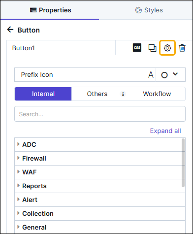
- Prefix Icon - To add a prefix icon next to the Button
click
and select an icon from the options available. To change the
size of the icon, click .
- Add link - Allows you to add Internal, Others (External), and Workflow link(s) for the Button.
- Prefix Icon - To add a prefix icon next to the Button
click
-
To hide the Button row, click
(View) icon. To display it again click (Hide) icon.
-
To delete the Button row, click
(Delete) icon.
-
To define the padding, margins, background color, font size, and
alignment for the Button within the card, click
(Layout) icon.
- Once you have configured all the settings, click Save.
- To add another button click Add Button.
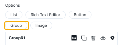
Configuring Grouping in the Card Widget
-
In the Card window, in the Properties tab, under
Options, click Group.
The Group row is displayed. You can rename this by typing over the existing name.
-
To expand the row and add a list, click
(Settings) icon.
-
In the Group configuration, to configure the group, click
(Settings) icon.
The following options are displayed as shown in the screenshot below:
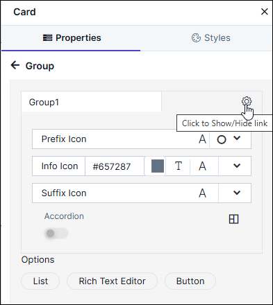
- Prefix Icon
- Info Icon
- Suffix Icon
- Accordion.
Table 3. Options Descriptions Option Description Prefix Icon - To add a prefix icon next to the
list name, click and select the required
icon from the options available.
- To increase or decrease the size of
the prefix icon, click and set the icon
size.
Info Icon - To add an Info icon next to the list
name, click and select the required
icon from the options available.
- To increase or decrease the size of
the Info icon, click and set the icon
size.
- To select a color for the info icon,
click the color picker
box and select the required color.
- To add info text, click and enter the text in the
textbox.
Suffix Icon - To add a suffix icon next to the
list name, click and select the required
icon from the options available.
- To increase or decrease the size of
the suffix icon, click and set the icon
size.
Accordion Allows you to hide or show large volumes of content in the card widget by turning this toggle on or off. You can select icons to Expand and Collapse the content in the card widget and also set the placement of these icons. - To add a List, Rich Text Editor, or Button in the Group, click on the respective link under Options.
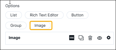
Configuring Images in the Card Widget
-
In the Card window, in the Properties tab, under
Options, click Image.
The Image row is displayed.
-
To configure an image, click
(Settings) icon.
-
To upload an image in the card widget, click
 (Upload) icon and upload the required image from your
computer.
Note: Allowed image formats are: .svg, .jpeg, and .png
(Upload) icon and upload the required image from your
computer.
Note: Allowed image formats are: .svg, .jpeg, and .png -
To delete this image and select another, click
 (Delete) icon.
-
To add another image, under Options, click Image.
A new Image row is displayed.
- Once you have added the required image(s), click Save.
Configuring the Card - Styles
-
For more options to customize the Card component, in the Card
window, click Styles.
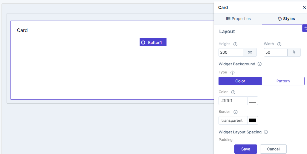
Table 4. Field descriptions for Styles Option Description Sizing Allows you to increase/decrease the height and width of the widget. Widget Background The following options are available here: - Add Background Pattern: To add a background pattern to the widget, select the Add Background Pattern checkbox and select a pattern from the available options.
- Widget Background Color: To add a background color to the widget, deselect the Add Background Pattern checkbox and select the color from the color palette.
- Widget Border Color: Allows you to change the color of the widget border.
Widget Header The following options are available here: - Header Text Color: Allows you to change the color of the header text.
- Header Text Size: Allows you to select the size of the header text.
- Header Text Underline: To underline the header text, select the Header Text Underline checkbox.
Widget Description The following options are available here: - Label text Color: Allows you to change the color of the label text.
- Label Text Size: Allows you to select the size of the label text.
Icon Style Allows you define the following style settings: - Icon Color - You can select the color for the icon from the available options.
- Icon Background - You can select the background for the icon from the available options.
- Icon Background Color - You can select the background color for the icon from the available options.
Widget Layout Style Allows you to define the padding and margin of the Card widget. - To save your settings, click Save.
-
To restore the settings under Styles to default, click
 (Restore) icon.