Form Field - Rich Text Editor
- Provision to define the font type and size, add font effects, highlight text in color, and add bulleted and numbered points.
- Provision to enable monospace.
- Provision to insert superscript and subscript.
- Provision to add links to external/internal pages.
- Provision to embed an internal/external page within the text editor.
- Provision to indent and align the text as per requirement.
- Provision to upload files to the page.
- Go to (Menu) > Automation > Service Catalog > Design.
- To design a new form page, click the + (Design) icon.
- Click the + (New Page) icon.
- On the displayed new page, in the Switch Layout pop-up, select either Single Page or Multi page to proceed. (You may even close the pop-up without selecting any option. Single Page is the default layout applied.)
- On the left click Build, and scroll down to view the Form components.
-
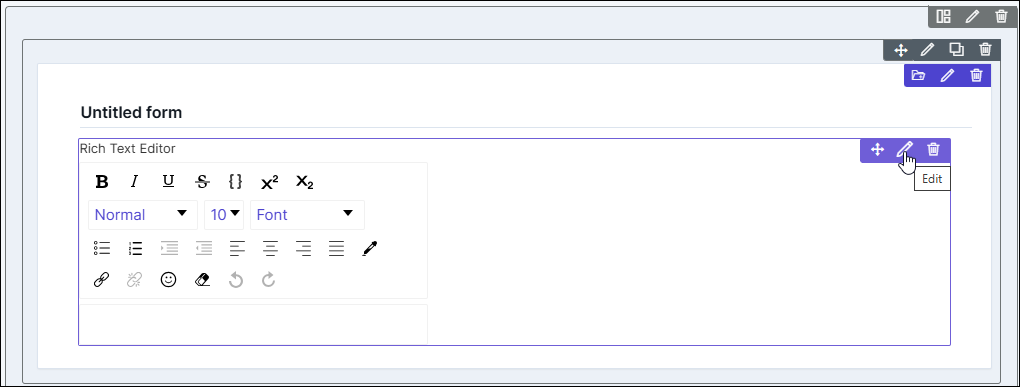
Select Rich Text Editor and drag it to the right on the new page.
The Rich Text Editor component is added in the form, with icons to Move, Edit, and Delete.
-
To modify the properties and styles click the Edit icon. Refer to the sections
below.
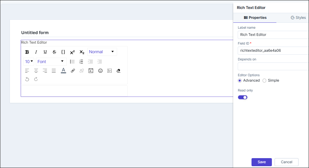
Editing Rich Text Editor Properties
| Fields | Description |
|---|---|
| Label name | Enter a valid name for the component. |
| Field ID | An auto-generated Id for the field, this can be edited. The
IDs are useful while creating hooks.
|
| Depends on | The "Depends On" property enables rendering a field based on
the selected data of another field. It establishes dependencies
between form elements, dynamically updating the form layout
based on user interactions. For example, if a user wants to
render a field to enter email id, only if the username matches
admin then the depends on value will be like
username:admin . Ideally the syntax would
be field_id:valueExamples are:
Note: For
AND operations only single ampersand (&) is used and for
OR operations only single pipe ( | ) is used |
| Editor Options | Select from any of the following:
|
| Read only | Allows you to define this field as read only or otherwise. If marked as Read Only, a red crossed circle is displayed when you hover your mouse over the read only field and does not allow you to enter any information. |
| Save / Cancel buttons | To update the changes, click Save. To undo the changes, click Cancel. |
Editing Rich Text Editor Styles
| Fields | Description |
|---|---|
| Font | |
| Weight | The Weight dropdown list lets you set the font thickness of the field label using one of the following values: Default, Light, Normal, Bold. |
| Size | Allows you to increase/decrease font size of the component/label name. |
| Line height | Allows you to increase/decrease the line height of the field. This means the space between the field and the field border. |
| Color | Allows you to define the color of the component/label name. |
| Align | Allows you to align the field name to the left, center or right side of the form. |
| Widget Background color | Allows you to choose a background color for the widget. |
| Widget Header - Padding | Allows you to adjust the top, right, bottom, and left padding of the widget in the form. |
| Field Size | Allows you to define the size of the form field as Small, Medium, or Large. |
| Save / Cancel / Restore buttons | To update the changes, click Save. To undo the changes, click Cancel. To restore the settings
to default, click |
 icon.
icon.