Form Field - Text Box
The Text Box component is a commonly used form input element that allows users to enter and edit single-line text data. It is ideal for capturing information like names, email addresses, or any other short text inputs.
- Go to (Menu) > Automation > Service Catalog > Design.
- To design a new form page, click the + (Design) icon.
- Click the + (New Page) icon.
- On the displayed new page, in the Switch Layout pop-up, select either Single Page or Multi page to proceed. (You may even close the pop-up without selecting any option. Single Page is the default layout applied.)
- On the left click Build, and scroll down to view the Form components.
-
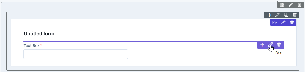
Select Text box and drag it to the right on the new page.
The Text box component is added in the form, with icons to Move, Edit, and Delete.
-
To modify the properties and styles click the Edit icon. Refer to the sections
below.
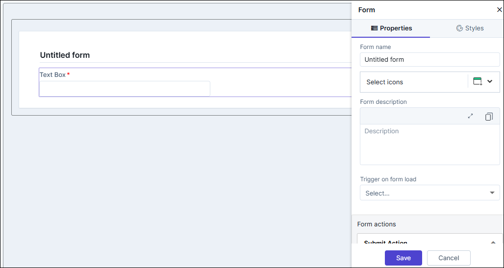
Editing Text Box Properties
| Fields | Description |
|---|---|
| Label name | Enter a valid name for the component. |
| Predefined Variable | Allows you to populate predefined values to appear in the text box field in the preview and published modes. The dropdown field contains values - Hostname, Port, and Origin. |
| Values | Allows you to define a values that will appear on the page
load in the preview and published mode. Once the page is loaded,
values can be edited in the field. Note: If the Predefined
Variables are selected, then those preset values
will take precedence over the text entered in the Values
field. |
| Field ID | An auto-generated Id for the field, this can be edited. The
IDs are useful while creating hooks.
|
| Hooks / Data Source | Allows you to assign an appropriate hook for this field. For
example, a hook to fetch the current date.
Note: For more information on
Assigning Hooks to Form Fields, click here. |
| Depends on | The "Depends On" property enables rendering a field based on
the selected data of another field. It establishes dependencies
between form elements, dynamically updating the form layout
based on user interactions. For example, if a user wants to
render a field to enter email id, only if the username matches
admin then the depends on value will be like
username:admin . Ideally the syntax would
be field_id:valueExamples are:
Note: For
AND operations only single ampersand (&) is used and for
OR operations only single pipe ( | ) is used |
| Validation | The Validation property provides users with the ability to
define validation rules for form fields. These rules ensure that
the entered data meets specific criteria, maintaining data
accuracy and integrity. Users have the privilege either to use
the validations already available or create custom regex
validation. Example: sample validation for No special characters and spaces are allowed except('-', '_') and name should not start with special characters. Maximum length mismatches. Maximum Length - 255 Validation Regex would be:
|
| Parent ID | Allows you to assign a Parent ID for fields in a table.
Select the relevant tabular component (Field ID) against which
the form field must be mapped to. Note: This is used only when defining a tabular element in the
form. |
| Help | Allows you to add Help text/tool-tip for the field. |
| Mandatory | Allows you to define this field as Mandatory or otherwise. If marked as mandatory, an asterisk (*) is displayed next to the field name in the form. |
| Read only | Allows you to define this field as read only or otherwise. If marked as Read Only, a red crossed circle is displayed when you hover your mouse over the read only field and does not allow you to enter any information. |
| Global variable | The "Global Variable" property enables users to reference and use global variables within form fields. These variables provide dynamic values that can be utilized in calculations or conditional logic within the form. |
| Hidden | Allows you to hide the fields in the form. Used mainly in the configuration of hooks. |
| Add On Label | Allows you to add a label after the text box field. For example, if the field is used to specify number of days, you may add "Days" as the add on label |
| Range Selection | Allow you to enter the values as a range. The text box is split in two with "To" in between both boxes (similar to "From" and "To" range values that are commonly seen in forms). |
| Save / Cancel buttons | To update the changes, click Save. To undo the changes, click Cancel. |
Editing Text Box Styles
| Fields | Description |
|---|---|
| Font | |
| Weight | The Weight dropdown list lets you set the font thickness of the field label using one of the following values: Default, Light, Normal, Bold. |
| Size | Allows you to increase/decrease font size of the field label name.. |
| Line height | Allows you to increase/decrease the line height of the field. This means the space between the field and the field border. |
| Color | Allows you to define the color of the field label name.. |
| Align | Allows you to align the field name to the left, center or right side of the form. |
| Field Size | Allows you to define the size of the form field as Small, Medium, or Large. |
| Save / Cancel / Restore buttons | To update the changes, click Save. To undo the changes, click Cancel. To restore the settings
to default, click |
 icon.
icon.