Form Field - Tabular
- To add a Tabular element to the form first design a form by adding form fields to the design canvas.
-
Drag and drop the Tabular field in the form.
-
Hover your mouse over a field, for example First Name, and click
 (Edit) icon.
The Text Box pop-up window opens with the Properties tab open by default.
(Edit) icon.
The Text Box pop-up window opens with the Properties tab open by default. -
In the Text Box pop-up window, under
Properties, select the Parent ID
as Tabular.
The field, First Name, is added to the Tabular.
-
Associate the Tabular’s field ID as the Parent ID for
other fields that are to be added to the form.
Note: When the Tabular field within a Form Group only the form fields present within that group can be added to that group’s Tabular.
-
Click Preview.
The Tabular opens in a new tab.Note: Any form fields not associated with the Tabular field will be displayed outside the Tabular.
-
To add data in the Tabular component, click Add.
The User Details’s fields window opens with the fields of the tabular displayed.
- In the User Details’s fields window, enter the values for the form fields.
-
Click Save.
The values are added to the Tabular.Note: The User Details’s fields window remains open for the user to add more fields.
- To close the Tabular’s fields window, click Cancel.
-
To edit a row in the Tabular, select the row to be edited.
The Edit button is enabled.
-
Click Edit.
Note: The Edit button is enabled only when you select exactly one row in the tabular. Selecting zero or more than 1 row will disable the Edit button.
- In the User Details’s fields window, modify the form field(s).
-
Click Update.
The Tabular’s fields window closes.
- To delete a row in the Tabular, select the row to be deleted.
-
Click Delete.
Note: The Delete button is enabled only when you select a single or multiple rows.
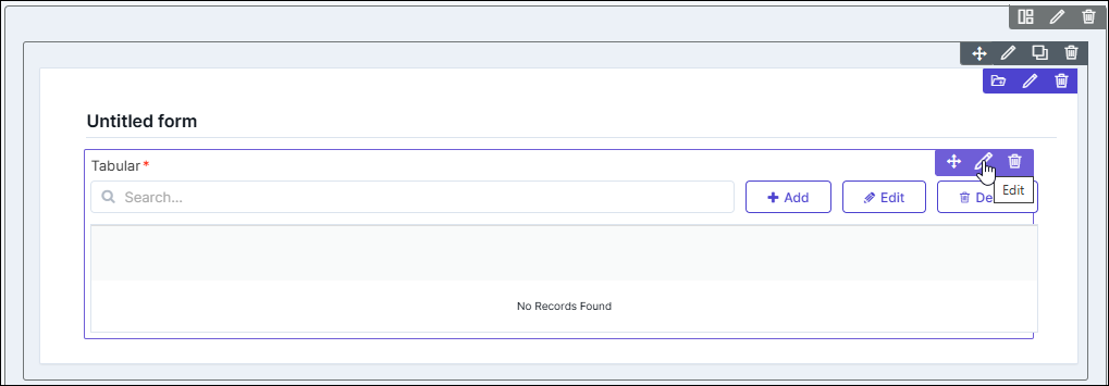
Configuring the Tabular - Properties
-
To configure the Tabular, hover your mouse over the field and click
(Edit) icon.
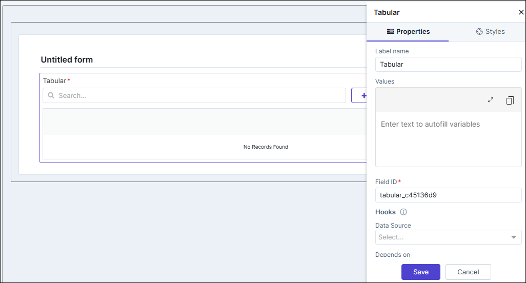 The Tabular pop-up window opens.
 -
In the Tabular window, under Properties, enter or select the
required fields.
Table 1. Field descriptions for Properties Field Description Label name* Enter a valid Label name for the form field. For example, Select Date and Time. Values Allows you to define field Values relevant to a form field. - Values can be delimited by a comma.
- Characters not allowed: ‘&’ and ‘|’.
Field ID* An auto-generated Id for the field, this can be edited. The IDs are useful while creating hooks. - Allowed characters: ‘-‘ and ‘_’
- Character Length: Min (1), Max (50).
Hooks Allows you to assign an appropriate hook for this field. For example, a hook to fetch the current date. - Select a hook that is relevant to the form field.
- Hooks can be either Script or REST API.
- Hooks are used to fetch details against a specific form field from the device and/or database and map them to the respective field on the user interface.
Note: For more information on Assigning Hooks to Form Fields, click here.Depends on The "Depends On" property enables rendering a field based on the selected data of another field. It establishes dependencies between form elements, dynamically updating the form layout based on user interactions. For example, if a user wants to render a field to enter email id, only if the username matches admin then the depends on value will be like username:admin. Ideally the syntax would be field_id:valueExamples are:username:admin username:admin&password:admin (username:admin)|(password:admin) (username:admin)&(password:admin) ((username:admin)&(password:admin))|(device:adc) (username:admin)|(password:startsWith.a) (username:admin)|(username:admin,user 1) //for multi -select boxNote: For AND operations only single ampersand (&) is used and for OR operations only single pipe ( | ) is usedHelp Allows you to add Help text/tool-tip for the field. Profile Access Allows you to select the profile from the dropdown to restrict form field display within a template based on the relevant profile. Mandatory Allows you to define this field as Mandatory or otherwise. If marked as mandatory, an asterisk (*) is displayed next to the field name in the form. Grid Universal Controls Allows you enable/disable the following features in the Tabular: - Search
- Pagination
- Actions.
Note: For more information on Grid Universal Controls, click here.*: Mandatory fields - Click Save.
Tabular - Grid Universal Controls
- Search - You can turn off the toggle for Search if you don’t want
the Search bar to be displayed in the Tabular. Enabling the Search bar
allows you to search for a particular item in the Tabular quickly.
- Search toggle is on and the search bar is displayed.
- Search toggle is off and the search bar is not displayed.
- Pagination - You can turn on the toggle for Pagination to display
the number of records that can be viewed on a page. Enabling Pagination
allows a page with high volumes of data to load faster.
- Pagination toggle is on and the record view is displayed.
- Pagination toggle is off and the record view is not displayed.
- Actions - You can turn off the Actions toggle if you don’t want
the Action buttons to be displayed in the Tabular. Enabling action
buttons such as Add, Edit, and Delete allows you to perform these
actions and modify the Tabular quickly.
- Actions toggle is on and the action buttons are displayed.
- Actions toggle is off and the action buttons are not displayed.
Configuring the Tabular with Hooks
- Design a page.
-
From the Build > Form section, drag and drop the
following form fields to design a form:
Field Type Label Name Field Values Parent ID Text Box Vendors A10, F5, Citrix - Text Box Device Name - Tabular Text Box IP Address - Tabular - Drag and drop a Tabular field to the form.
-
To configure the Tabular, hover your mouse over the field and
click
(Edit) icon.
The Tabular pop-up window opens with the Properties tab open by default.
-
In the Tabular window, under Properties, select an
appropriate hook for getting the device list.
Note: You can also create a hook that meets your requirements. For more information on assigning hooks to form fields, click here.
- Click Save.
-
Preview the form.
The form opens in a new tab.
- In the Vendors field, select an option from the dropdown.
-
To trigger the hook and get the device list based on vendor and
auto-populate the form, click
 above the Tabular field.
The Tabular is populated with the device list fetched from the hook.
above the Tabular field.
The Tabular is populated with the device list fetched from the hook.
Configuring the Tabular - Styles
-
For more options to customize the Tabular, in the Tabular window,
click Styles.
Table 2. Field descriptions for Styles Field Description Weight Title Allows you to define the following features in the Widget Title: - Weight - The Weight dropdown list lets you set the font thickness of the field label.
- Size - Allows you to increase/decrease font Size of the field name.
- Line height - Allows you to increase/decrease the Line height of the field. This means the space between the field and the field border.
- Color - Allows you to define the Color of the field label.
- Align - Allows you to Align the field label to the left, center or right side of the field.
Grid Data Text Allows you to define the following features for header text: - Header Row Text Color - Allows you to select the color for the text in the Header row from the color picker or the color palette.
- Header Row Text Size - Allows you to set the size of the text in the Header row.
- Header text Alignment - Allows you to align the text in the Header row to the left, center or right side.
- Data Text Color - Allows you to select the color for the data text from the color picker or the color palette.
- Data Text Size - Allows you to set the size of the data text in the Tabular.
- Data Text Alignment - Allows you to align the data text to the left, center or right side.
- To save your settings, click Save.
-
To restore the settings under Styles to default, click
 (Restore) icon.