Form Field - Form Button
- Go to (Menu) > Automation > Service Catalog > Design.
- To design a new form page, click the + (Design) icon.
- Click the + (New Page) icon.
- On the displayed new page, in the Switch Layout pop-up, select either Single Page or Multi page to proceed. (You may even close the pop-up without selecting any option. Single Page is the default layout applied.)
- On the left click Build, and scroll down to view the Form components.
-
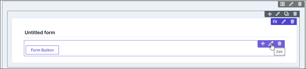
Select Form Button and drag it to the right on the new page.
The Form Button component is added in the form, with icons to Move, Edit, and Delete.
-
To modify the properties and styles click the Edit icon. Refer to the sections
below.
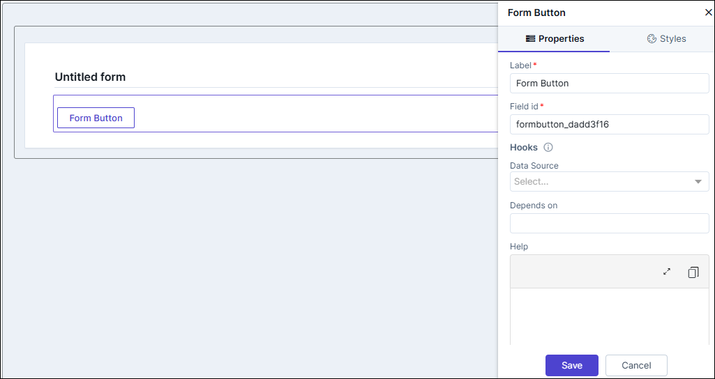
Editing Form Button Properties
| Fields | Description |
|---|---|
| Label name | Enter a valid name for the component. |
| Field ID | An auto-generated Id for the field, this can be edited. The
IDs are useful while creating hooks.
|
| Hooks / Data Source | Allows you to assign an appropriate hook for this field. For
example, a hook to fetch the current date.
Note: For more information on
Assigning Hooks to Form Fields, click here. |
| Depends on | The "Depends On" property enables rendering a field based on
the selected data of another field. It establishes dependencies
between form elements, dynamically updating the form layout
based on user interactions. For example, if a user wants to
render a field to enter email id, only if the username matches
admin then the depends on value will be like
username:admin . Ideally the syntax would
be field_id:valueExamples are:
Note: For AND operations only single
ampersand (&) is used and for OR operations only single
pipe ( | ) is used |
| Parent ID | Allows you to assign a Parent ID for fields in a table.
Select the relevant tabular component (Field ID) against which
the form field must be mapped to. Note: This is used only when defining a tabular element in the
form. |
| Help | Allows you to add Help text/tool-tip for the field. |
| Read only | Allows you to define this field as read only or otherwise. If marked as Read Only, a red crossed circle is displayed when you hover your mouse over the read only field and does not allow you to enter any information. |
| Save / Cancel buttons | To update the changes, click Save. To undo the changes, click Cancel. |
Editing Form Button Styles
| Fields | Description |
|---|---|
| Layout | |
| Background - Color | Allows you to change the background color of the button (behind the text). |
| Border - Color | Allows you to change the border color of the button. |
| Border - Style | Allows you to change the border type to dotted, dashes etc. Select the appropriate values from the dropdown. |
| Border - Width | Allows you to change the border width (top, bottom, right, left) by pixels. |
| Set Box shadow on hover | Allows you to enable the shadow when hovering over the button. |
| Field Label | |
| Weight | The Weight dropdown list lets you set the font thickness of the field label using one of the following values: Default, Light, Normal, Bold. |
| Size | Allows you to increase/decrease font size component (label) name. |
| Line height | Allows you to increase/decrease the line height of the field. This means the space between the field and the field border. |
| Color | Allows you to define the color of the field text. |
| Spacing (area inside the button) | |
| Padding | Allows you define the spacing between the button text and the button borders from the top, left, bottom, and right. |
| Margin | Allows you define the spacing of button layout in the form, from the top, left, bottom, and right. |
| Background - Color | Allows you define the background color (which is between the button and the form borders) from the top, left, bottom, and right. |
| Border - Color | Allows you define the background border color (which is between the button and the form borders) from the top, left, bottom, and right. |
| Border - Style | Allows you define the background border color (which is between the button and the form borders) from the top, left, bottom, and right. |
| Border - Width | |
| Layout Spacing (area outside the button) | |
| Padding | Allows you define the spacing between the button and the background area from the top, left, bottom, and right. |
| Margin | Allows you define the spacing of button layout in the form, using the top, left, bottom, and right pixel adjustments. |
| Field Size | |
| Save / Cancel / Restore buttons | To update the changes, click Save. To undo the changes, click Cancel. To restore the settings
to default, click |
 icon.
icon.