Configuring a Form
- Go to (Menu) > Automation > Service Catalog > Design.
- To design a new form page, click the + (Design) icon.
- Click the + (New Page) icon.
- On the displayed new page, in the Switch Layout pop-up, select either Single Page or Multi page to proceed. (You may even close the pop-up without selecting any option. Single Page is the default layout applied.)
- On the left click Build, and scroll down to view the Form components.
-
Select any of the form components and drag it to the right on the empty new
page.
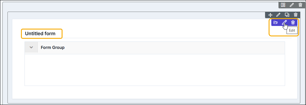
The Untitled form page is created with icons to Save, Edit, and Delete.
-
To modify the form properties and styles click the Edit icon. Refer to the
sections below.
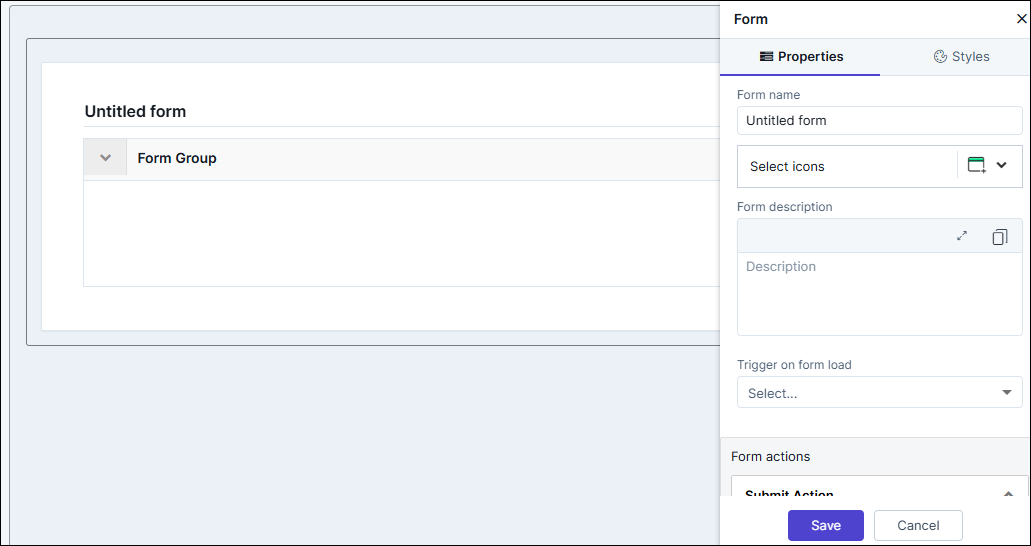
Editing Form Properties
| Fields | Description |
|---|---|
| Form name | Enter a suitable name for the form. The name is displayed on the top left of the form. |
| Select icons | Click the dropdown to choose the icons to display before the form name. |
| Form description | Enter a suitable description; displayed below the form name. |
| Select scripts to run on form load | The hooks associated with all the added form components are displayed in the dropdown. |
| Reset Action | To display a Reset button on the form turn ON the toggle button. This button reset all the form fields (components) to blank or default value. |
| Button label name | This field is displayed only if the Reset Action is turned ON. The default value is "Reset" to change the value, enter the desired name. |
| Action Alignment | Choose from Left, Center, or Right to display the action buttons (Submit, Reset, etc) as per the required alignment. |
| Form Layout | Choose the following:
|
| Group Options | The properties of this component are enabled when the Form Group component is added to the form. Refer Form Group for more details |
| Form Actions (Submit) | |
| Button label name | Enter a name for the button. The default value is "Submit". |
| Data Source | Hooks associated with the component will be displayed in the dropdown. Select any. To import hooks from the hooks inventory click Import or to create a new hook, click Create New. |
| Enable page redirect | Turn ON the toggle button to perform a redirect operation on the button. |
| Redirect URL | This field is displayed only if the Enable page
redirect is turned ON. Enter a URL for redirect on click
of Submit button. Note: If the Data
Source (hooks) and Redirect URL are both
enabled for the form. The Data Source takes the highest
priority. |
| Open link in the pop-up | This checkbox is displayed only if the Enable page redirect is turned ON. To view the redirected URL on a separate window, click the checkbox.. |
| Enable Pop-up Title | To display a title for the window, turn ON the toggle button. |
| Enter Pop-up Title | This field is enabled when the Enable Pop-up Title is turned ON. Enter a suitable title for the pop-up window. |
| Choose Pop-up Position | This field is enabled when the Enable Pop-up Title is turned ON. Choose Right Aligned or Center Aligned for the pop-up window. |
| Choose Pop-up Width | This field is enabled when the Enable Pop-up Title is turned ON. Choose Small, Medium, or Large size for the pop-up window. |
| Disable action | Allows to disable the Submit button. (If the button is disabled, it can be configured in the final published form to become enabled either after all the required details are entered or based on the conditions defined in the hooks.). |
| Button Theme | This option is enabled only when new action buttons are
added. The primary button, displayed in violet,
represents the main action on the form, while the
secondary buttons, shown in white, are used for less
critical actions. Note: The Submit action
is default Primary on the form. |
Editing Form Styles
| Fields | Description |
|---|---|
| Theme | Choose the following
|
| Widget Background | |
| Type | This setting is used to change the background color for the
entire form.
|
| Border | This setting is used to change the outer border color for the entire form. Pick a color from the color-picker. |
| Header | |
| Color | Choose the text color for the Form Name. |
| Size | Choose a text size for the Form Name. |
| Description - Color | Choose a text color for the Form Name's Description |
| Description - Text Weight | Choose a text weight (Normal, Semi-Bold, Bold, Black) for the Form Name's Description |
| Border Bottom - Border Color | Choose a color for the border below the Form Name. |
| Border Bottom - Border Width | Choose a width (numeric) for the border below the Form Name. |
| Icon Style | Choose from the four colors for the icon displayed before the form name. |
| Form Group(To maintain a common style for the Form Group components added in the form, the style settings for the Form Group lies within the Form). | |
| Header - Color | Choose the text color for the Form Group's name. |
| Header - Size | Choose the text size for the Form Group's name. |
| Header - Weight | Choose the text weight (Normal, Semi-Bold, Bold, Black) for the Form Group's name. |
| Border & Spacing - Color | Choose a color for the border below the Form Group component. |
| Border & Spacing - Width | Choose a color for the border width below the Form Group component. |
| Header Description - Color | Choose a text color for the Form Group's description. |
| Header Description - Size | Choose a text size for the Form Group's description. |
| Header Description - Weight | Choose a text weight (Normal, Semi-Bold, Bold, Black) for the Form Group's description. |
| Content (To maintain a common style for the Form components added in the form, the style settings pertaining to the component names and fields lies within the Form). | |
| Form Field Label - Color | Choose a text color for the labels of the form components. |
| Form Field Label - Size | Choose a text size for the labels of the form components. |
| Form Field Label - Weight | Choose a text weight (Normal, Semi-Bold, Bold, Black) for the labels of the form components. |
| Form Field - Color | Choose a color for text that is entered with the form fields (text box, description box etc). |
| Form Field - Size | Choose a size for text that is entered within the form fields (e.g.: text box, description box etc). |
| Form Field - Weight | Choose a weight (Normal, Semi-Bold, Bold, Black) for text that is entered with the form fields (e.g.: text box, description box etc). |
| Form Field - Border Color | Choose a color for the form component's border. |
| Form Field - Field Height | Choose the height for the form component's border. |
| Form Field - Field Border Radius | Choose the border radius (curved borders) for the form component's border. |
| Field Size | Choose the overall field size (Small, Medium, Large) for the
form components.
|
Saving Forms to Custom Folder
To save a form in the custom folder:
-
Hover your mouse over the form and from the top right corner, click
 (Folder) icon.
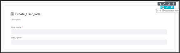
-
In the Confirmation pop-up window, click Yes.
The form is added to the Custom folder in the Inventory section.
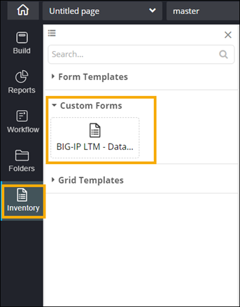
- To reuse a custom form, simply drag and drop the required form from the Custom folder into the canvas.