Form Field - Label
The Label component is a fundamental element within a form that serves the purpose of providing descriptive text or a title for form fields. It offers context and guidance to users, helping them understand the purpose of each field. It is mainly used to club together various properties within the tabular component.
- Go to (Menu) > Automation > Service Catalog > Design.
- To design a new form page, click the + (Design) icon.
- Click the + (New Page) icon.
- On the displayed new page, in the Switch Layout pop-up, select either Single Page or Multi page to proceed. (You may even close the pop-up without selecting any option. Single Page is the default layout applied.)
- On the left click Build, and scroll down to view the Form components.
-
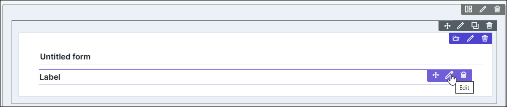
Select Label and drag it to the right on the empty new page.
The Label component is added in the form, with icons to Move, Edit, and Delete.
-
To modify the properties and styles click the Edit icon. Refer to the sections
below.
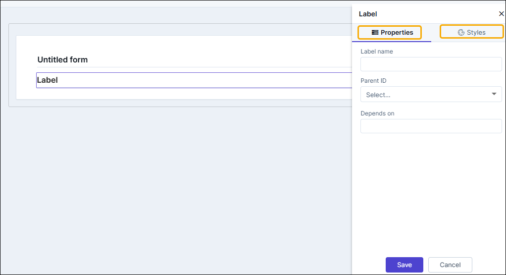
Editing Label Properties
| Fields | Description |
|---|---|
| Label name | Enter a valid name for the component. |
| Parent ID | It displays the ID generated for the tabular component added to the form. In the preview and published modes, the label won't appear on its own, but within the associated tabular component. |
| Depends on | The "Depends On" property enables rendering a field based on
the selected data of another field. It establishes dependencies
between form elements, dynamically updating the form layout
based on user interactions. For example, if a user wants to
render a field to enter email id, only if the username matches
admin then the depends on value will be like
username:admin . Ideally the syntax would
be field_id:valueExamples are:
Note: For
AND operations only single ampersand (&) is used and for
OR operations only single pipe ( | ) is used |
Editing Label Styles
| Fields | Description |
|---|---|
| Font | |
| Weight | The Weight dropdown list lets you set the font thickness of the field label using one of the following values: Default, Light, Normal, Bold. |
| Size | Allows you to increase/decrease font size of the label name. |
| Line height | Allows you to increase/decrease the line height of the field. This means the space between the field and the field border. |
| Color | Allows you to define the color of the label name. |
| Align | Allows you to align the field name to the left, center or right side of the form. |
| Spacing | |
| Padding | Allows you to increase/decrease the space between the label name and border from the top, right, bottom, and left settings |
| Margin | Allows you to increase/decrease the border margins form the label name from the top, right, bottom, and left settings |
| Border Bottom | |
| Border Color | Allows you to define the color of the label border. |
| Border Width | Allows you to increase/decrease the width of the label border. |
| Save / Cancel / Restore buttons | To update the changes, click Save. To undo the changes, click Cancel. To restore the to
default, click |
 icon.
icon.