Form Field - File Upload
- Go to (Menu) > Automation > Service Catalog > Design.
- To design a new form page, click the + (Design) icon.
- Click the + (New Page) icon.
- On the displayed new page, in the Switch Layout pop-up, select either Single Page or Multi page to proceed. (You may even close the pop-up without selecting any option. Single Page is the default layout applied.)
- On the left click Build, and scroll down to view the Form components.
-
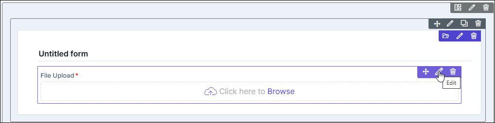
Select File Upload and drag it to the right on the new page.
The File Upload component is added in the form, with icons to Move, Edit, and Delete.
-
To modify the properties and styles click the Edit icon. Refer to the sections
below.
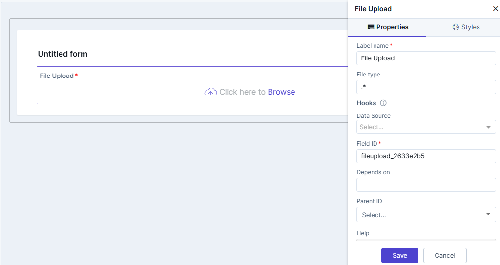
Editing File Upload Properties
| Fields | Description |
|---|---|
| Label name | Enter a valid name for the component. |
| File Types | Allows you to define the types of files that can be uploaded. Enter values with . (dot) and file extension, such as .csv. To allow multiple file types enter the value as .*. |
| Hooks / Data Source | Allows you to assign an appropriate hook for this field. For
example, a hook to fetch the current date.
Note: For more information on
Assigning Hooks to Form Fields, click here. |
| Password Required | Enable the toggle button and enter the password for the uploaded file in the Password required for file types field provided. |
| Field ID | An auto-generated Id for the field, this can be edited. The
IDs are useful while creating hooks.
|
| Depends on | The "Depends On" property enables rendering a field based on
the selected data of another field. It establishes dependencies
between form elements, dynamically updating the form layout
based on user interactions. For example, if a user wants to
render a field to enter email id, only if the username matches
admin then the depends on value will be like
username:admin . Ideally the syntax would
be field_id:valueExamples are:
Note: For AND operations only single
ampersand (&) is used and for OR operations only single
pipe ( | ) is used |
| Parent ID | Allows you to assign a Parent ID for fields in a table.
Select the relevant tabular component (Field ID) against which
the form field must be mapped to. Note: This is used only when defining a tabular element in the
form. |
| Help | Allows you to add Help text/tool-tip for the field. |
| Mandatory | Allows you to define this field as Mandatory or otherwise. If marked as mandatory, an asterisk (*) is displayed next to the field name in the form. |
| Read only | Allows you to define this field as read only or otherwise. If marked as Read Only, a red crossed circle is displayed when you hover your mouse over the read only field and does not allow you to enter any information. |
| Global variable | The "Global Variable" property enables users to reference and use global variables within form fields. These variables provide dynamic values that can be utilized in calculations or conditional logic within the form. |
| Save / Cancel buttons | To update the changes, click Save. To undo the changes, click Cancel. |
Editing File Upload Styles
| Fields | Description |
|---|---|
| Header Font | |
| Weight | The Weight dropdown list lets you set the font thickness of the field label using one of the following values: Default, Light, Normal, Bold. |
| Size | Allows you to increase/decrease font size of the component/label name. |
| Line height | Allows you to increase/decrease the line height of the field. This means the space between the field and the field border. |
| Color | Allows you to define the color of the component/label name. |
| Align | Allows you to align the field name to the left, center or right side of the form. |
| Field Size | Allows you to define the size of the form field as Small, Medium, or Large. |
| Save / Cancel / Restore buttons | To update the changes, click Save. To undo the changes, click Cancel. To restore the settings
to default, click |
 icon.
icon.