Alert
Configuring the Alert Widget - Properties
- From the Build component in the left menu, under the Widgets section, drag and drop the Alert widget to any blue highlighted space on the page.
-
To configure/edit the Alert widget,
hover your mouse over the widget and click
 (Edit) icon.
 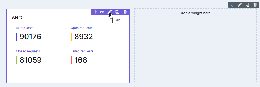 The Alert widget window opens with the Properties tab open by default.
 -
In the Alert window, under the Properties
tab, enter or select the required field
information.
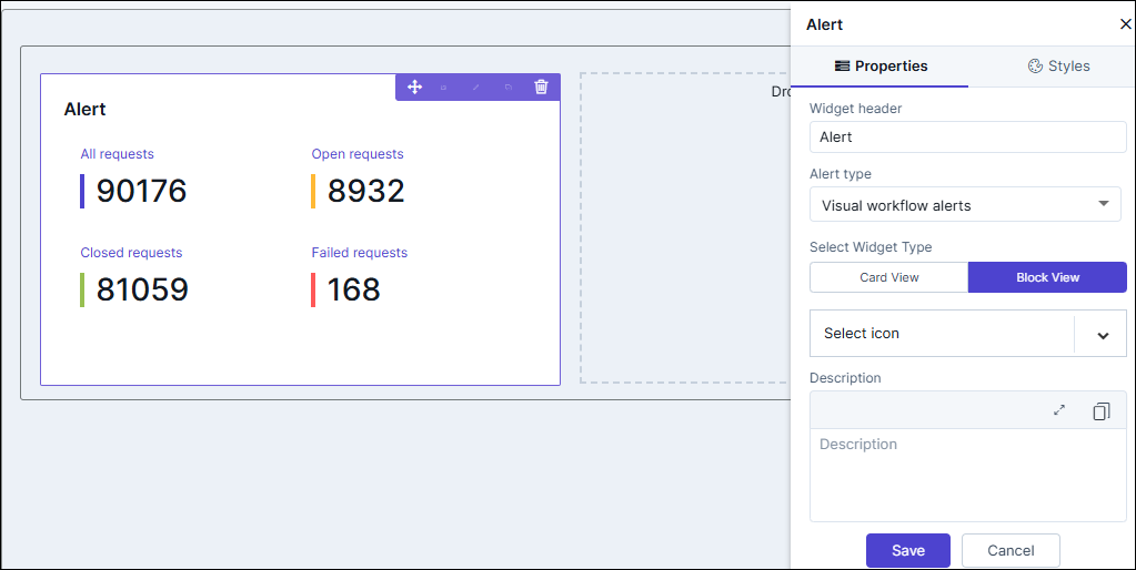
Table 1. Field descriptions for Properties Field Description Widget header Allows you to rename the widget header. Alert Type Allows you to select the Alert Type from the options available in the dropdown. Select Widget Type Allows you to switch between Card View and Block View. - Card View: In this option, the VW requests are displayed in a card layout, providing a concise view with essential information for each request.
- Block View: In this option, the VW requests are displayed in a block layout, allowing users to view multiple requests in a list format.
Select Widget Icon Allows you to select an icon for the widget from the options available in the dropdown. Description Allows you to add a description for the widget. - Click Save.
Configuring the Alert widget - Styles
-
For more options to customize the Alert
widget, in the Alert window, click
Styles.
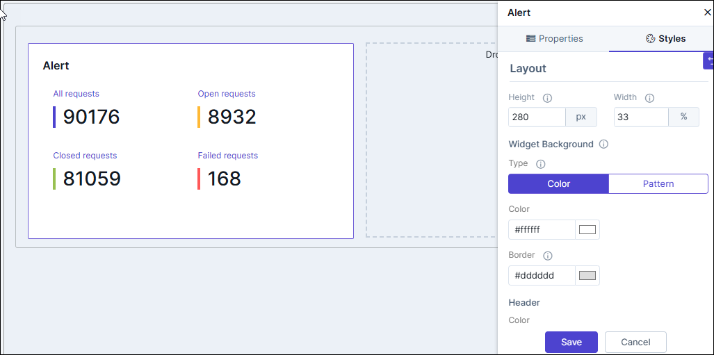
Table 2. Field descriptions for Styles Field Description Sizing Allows you to increase/decrease the height and width of the widget. Widget Background The following options are available here: - Add Background Pattern: To add a background pattern to the widget, select the Add Background Pattern checkbox and select a pattern from the available options.
- Widget Background Color: To add a background color to the widget, deselect the Add Background Pattern checkbox and select the color from the color palette.
- Widget Border Color: Allows you to change the color of the widget border.
Widget Header The following options are available here: - Header Text Color: Allows you to change the color of the header text.
- Header Text Size: Allows you to select the size of the header text.
- Header Text Underline: To underline the header text, select the Header Text Underline checkbox.
Widget Description The following options are available here: - Label text Color: Allows you to change the color of the label text.
- Label Text Size: Allows you to select the size of the label text.
- To save your settings, click Save.
-
To restore the settings under Styles to default,
click
 (Restore) icon.