Grid
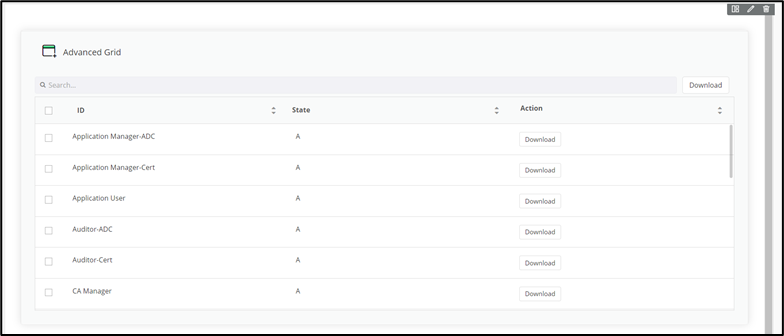
The Grid widget is an efficient and versatile tool used to display data in a tabular manner. It offers multiple actions and features that enhance data presentation and interaction. Along with common properties like widget header, icon, description, and style properties. The Grid widget includes two main features: Grid Universal Control and Column Configurations.
Configuring the Grid - Properties
- From the Build component in the left menu, under the Widgets section, drag and drop the Grid widget to any blue highlighted space on the page.
-
To configure the Grid, hover your mouse over the field and click
 (Edit) icon.
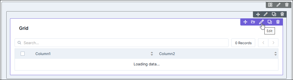 The Grid pop-up window opens with the Properties tab open by default.
 -
In the Grid window, under Properties, enter or select the
required field information.
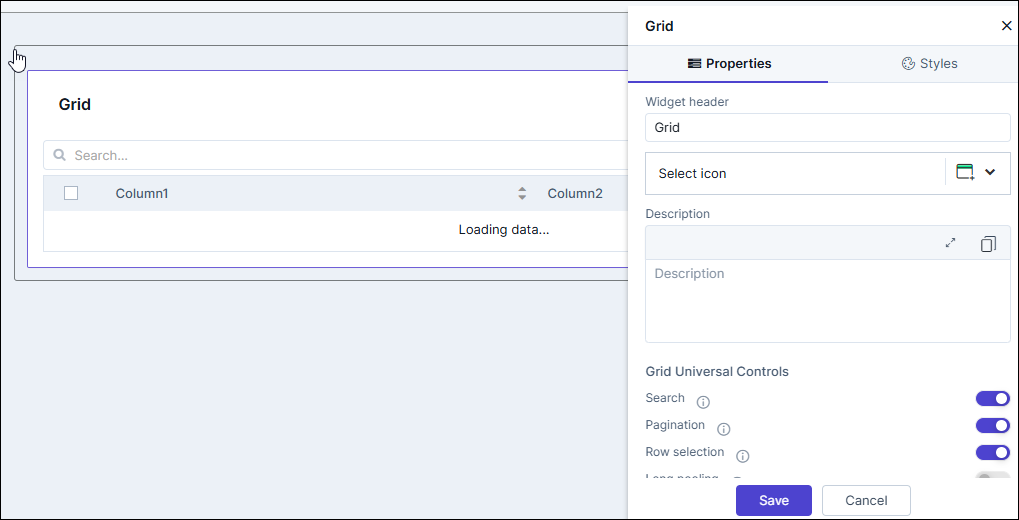
Table 1. Field descriptions for Properties Field Description Widget header Allows you to rename the widget header. Select icon Allows you to select an icon for the widget from the options available in the dropdown. Description Allows you to add a description for the widget. Grid Universal Controls Allows you to enable/disable the following: - Search:Turn on the toggle for Search to
display the search bar in the grid. Enabling the
Search bar allows you to quickly search for a
particular item in the grid. If this toggle button
is enabled the Grid Header Search Size
Configuration is displayed below the Grid
Universal Controls section. The size of the
search bar can be made
- Small (35%)
- Medium (60%)
- Large (100%) - By default, the width is set to Large.
- Pagination: Turn on the toggle for Pagination to display the number of records that can be viewed on a page. Pagination enables users to navigate through large datasets efficiently, breaking the data into manageable pages.
- Row selection: Turn on the toggle for Row selection to select one or more rows from the displayed data to perform specific actions.
- Long pooling: Turn on the toggle for Long
pooling to maintain real-time data updates. Long
polling allows the server to hold the request open
until new data is available. The data is retrieved
from the server based on the long pooling time
specified.
- Long pooling time (sec): Enter the time in seconds for requesting data at fixed intervals.
- Actions: Turn on the Actions toggle to display the Action buttons in the grid. The action button enables Add, Edit, and Delete operation for selected items in the grid. Refer to the section Configuring Actions in the Grid.
- Filters: Turn on the Filters toggle to display the Select Filter dropdown next to search bar. Refer to the section Configuring Filters in the Grid.
- Refresh: Turn on the Refresh toggle to display the refresh icon on the grid. Clicking this icon will refresh the data in the grid as desired.
- Enable Server Control: Turn on the Enable Server Control toggle to display the "previous" and "next" icon along with the total number of displayed values. This limits the number of values displayed on the grid and clicking the "previous" and "next" icon triggers and API to server to fetch the previous or next set of records from the server.
Hooks Allows you to assign an appropriate hook for this field. - Select a hook that is relevant to the form field.
- Hooks can be either Script or REST API.
- Hooks are used to fetch details against a specific form field from the device and/or database and map them to the respective field on the user interface.
Note: For more information on Adding Hooks to Form Fields, click here.Column Preferences Allows you to configure the columns in the grid. - Search:Turn on the toggle for Search to
display the search bar in the grid. Enabling the
Search bar allows you to quickly search for a
particular item in the grid. If this toggle button
is enabled the Grid Header Search Size
Configuration is displayed below the Grid
Universal Controls section. The size of the
search bar can be made
- Click Save.
Configuring Filters in the Grid
-
If the Filters toggle is enabled, the Configure Filters
section is displayed.
The Add Filter button and "customFilter_1" default filter is displayed (which can be configured)
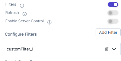
- To add more filters, click the Add Filter button.
-
To configure the filters, click the
 (down arrow) icon.
The following options are displayed.
(down arrow) icon.
The following options are displayed.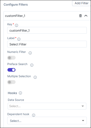
- Key (text field)
- Label (text field)
- Numeric Filter (toggle)
- Preface Search (toggle)
- Multiple Selection (toggle)
- Options (radio buttons for Hooks).
-
Enter the details as specified below.
Field Description Key Enter a name for the filter. Label Enter the label that will appear in the Search Filter dropdown list. Numeric Filter Enable this toggle button to display numeric values (as specified in the hook) above the grid. Preface Search This toggle is disabled if the Numeric Filter is enabled. Enable this toggle to view and use the filter labels in the Search Filter dropdown.
Multiple Selection This toggle is disabled if the Numeric Filter is enabled. Enable this toggle to select multiple filter labels in the Search Filter dropdown.
Options The radio button for Hook to be used for the filters. Assign a hook by selecting an option from the dropdown. For example, Import the Get all roles hook.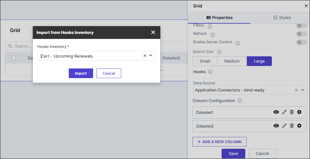 Note: For more information on Adding Hooks to Form Fields, click here.
 -
Click Save.
The filters are enabled and available to use in the grid.
-
To delete the filters, click
 (delete icon).
Configuring Actions in the Grid
- If the Actions toggle is enabled, the Action Configuration section is displayed.
-
To customize colors for the Action button, the edit values in the
following values:
Fields Description Action Background Color Click  (Color Palette) to chose
the color scheme then click
(Color Palette) to chose
the color scheme then click  to chose the
color.
to chose the
color.Action Border Color Click (Color Palette) to chose
the color scheme then click to chose the
color.Action Text Color Click  (Color Palette) to chose
the color scheme then click to chose the
color.Note: The above properties will affect all the configured Action buttons.
(Color Palette) to chose
the color scheme then click to chose the
color.Note: The above properties will affect all the configured Action buttons. -
An Action button will be present in the Action Configuration,
you may edit that using the Edit (pencil) icon or click +Add
Action and enter the following details.
Fields Description Action Label Enter a suitable label for the action to be performed. Action Icon Select an appropriate icon for the desired action. Action Type Choose from - Download
- Others (default selected)
- Link
Select Action Hook This field is displayed only when Action Type = Others and Download. Click the dropdown and Import the hooks or create a new hook for the desired action.
Download Type This field is displayed only when Action Type = Download. Select any one of file formats in which the data has to be downloaded.- TXT (default selected)
- YAML
- SH
- CSV
- ZIP
- JSON
Link Configuration This field is displayed only when Action Type = Link. Select/Enter the fields as described below. - Internal / External: Select Internal and enter the valid published internal page OR select External and enter the desired URL.
- Open link in pop-up: Select the check box to display the link in a pop-up window. Only valid internal pages will be rendered from this option.
- Enable Pop-up Title: Enable this toggle button to display a title for the pop-up and then type the title in the Enter Pop-up Title field. Only valid published pages will open in a pop-up.
- Choose Pop-up Position: Choose from Right Aligned or Center Aligned
- Choose Pop-up Width: Choose from Small/ Medium/ Large /Custom. If you choose Custom then enter the Height and Width.
Note: It is mandatory to have either the Action Label or Action Icon for the Action button. - Click Save.
-
To display grid actions as a dropdown, enable the Show Grid actions
as dropdown toggle button.
The default Group button and +Add Group buttons are displayed.
-
To edit the default Group, hover over the Group button and click the
pencil (Edit) icon.
The group configuration fields are displayed.
-
Enter details in the fields below to configure the Group button for
actions.
Fields Description Group Label Enter a suitable label for the group button. Group Icon Select an appropriate icon for the group button. Actions to be Grouped All the Actions buttons configured will be displayed in this dropdown list. Choose as many action to add to the goup - Click Save.
- To add action buttons to column refer to the section Configuring Columns in the Grid.
Configuring Columns in the Grid
-
In the Grid window, under Properties, assign a hook by
selecting an option from the dropdown. For example, Import the
Get all roles hook.
Note: For more information on Adding Hooks to Form Fields, click here.
-
Under Columns Preferences, to change the name of the first
column, click
 (Edit) icon.
-
Type the name of the column as required and click
 .
.
-
To configure the Column Type, click
 icon.
The following options are available:
icon.
The following options are available:- Plaintext: Select this option to display the column items as plain text.
- Link: Select this option to add links to each column item.
- Actions: Select this option to add actions such as Download or Delete to the columns.
-
To configure links for the column items, under Column Type,
click Link.
The Link Configuration option is displayed.
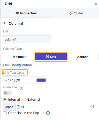
- Select the color for the Link Text.
- Select the Text Underline checkbox to underline the link text.
- Select the type of link to be assigned to the column fields. For example, Internal.
- Clicking on any role under the Name column, will redirect to the linked page.
-
To configure an action for a column, under Column Type, click
Actions.
The Action Configuration option is displayed.
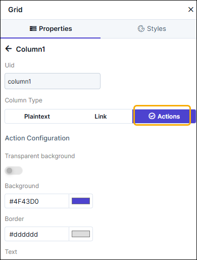
- Select the Action Background Color.
- Select the Action Border Color.
- Select the Action Text Color.
-
To add an action for the column field, hover your mouse over
Action and click
 (Edit) icon.
 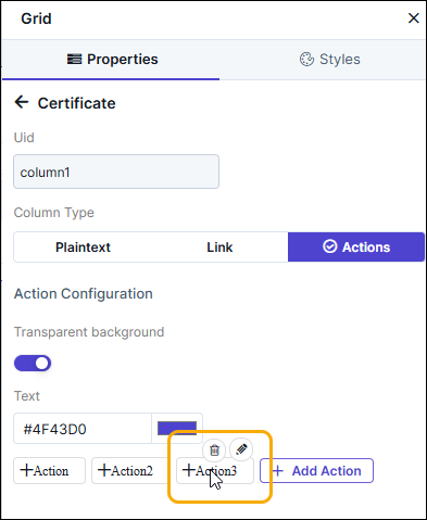 More fields to add the action are displayed as shown.
 - Enter the Action label. For example: Download.
- Select the Action Type as Download or Others. For example, select Download to download the list of roles to your machine as a .csv file.
-
Select the hook to be assigned to the action. For example: Role
Download.
Note: For more information on Adding Hooks to Form Fields, click here.
-
Click Save.
The configured action is added to the grid.Note: You can also add actions to the grid by turning on the Actions toggle under Grid Universal Controls.
- To add more actions to the grid, under Action Configuration, click Add Action.
-
For options on configuring this action, hover your mouse over the
action and click
(Edit) icon.
-
To delete this action, hover your mouse over the action and click
 (Delete) icon.
Configuring the Grid - Styles
-
For more options to customize the Grid component, in the Grid
window, click Styles.
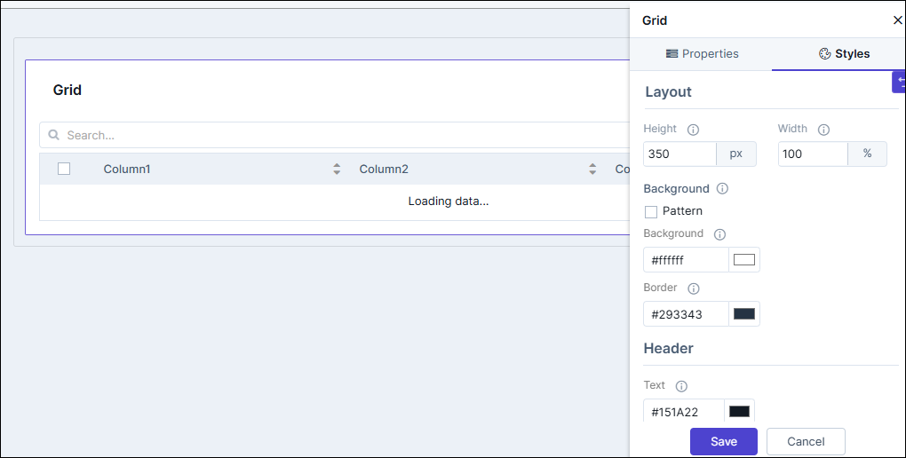
Table 2. Field descriptions for Styles Field Description Sizing Allows you to increase/decrease the height and width of the widget. Widget Background The following options are available here: - Add Background Pattern: To add a background pattern to the widget, select the Add Background Pattern checkbox and select a pattern from the available options.
- Widget Background Color: To add a background color to the widget, deselect the Add Background Pattern checkbox and select the color from the color palette.
- Widget Border Color: Allows you to change the color of the widget border.
Widget Header The following options are available here: - Header Text Color: Allows you to change the color of the header text.
- Header Text Size: Allows you to select the size of the header text.
- Header Text Underline: To underline the header text, select the Header Text Underline checkbox.
Tabular Header Style The following options are available here: - Header Background Color - Select the background color for the header from the available options.
- Header Text Color - Select the header text color from the available options.
- Header Text Size - Select the header text size from the available options.
- Header Text Alignment - Select the header alignment as left, right or centre.
Tabular Row Style The following options are available here: - Row Background Color - Select the background color for the row from the available options.
- Row Color - Select the row color from the available options.
- Row Text Size - Select the row text size from the available options.
- Row Text Alignment - Select the row alignment as left, right or centre.
Icon Style The following options are available here: - Icon Color - Select the Icon Color from the available options.
- Icon Background - Select the Icon Background from the available options.
- Icon Background Color - Select the Icon Background Color from the available options.
- To save your settings, click Save.
-
To restore the settings under Styles to default, click
 (Restore) icon.