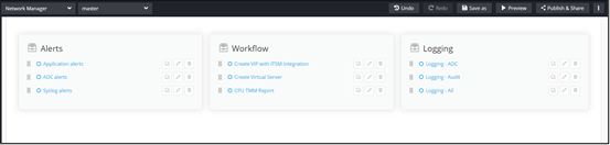
Quick Links
Configuring Quick Links - Properties
- From the Build component in the left menu, under the Widgets section, drag and drop the Quick links widget to any blue highlighted space on the page.
-
To configure the Quick links component, hover your mouse over the widget
and click
 (Edit) icon.
 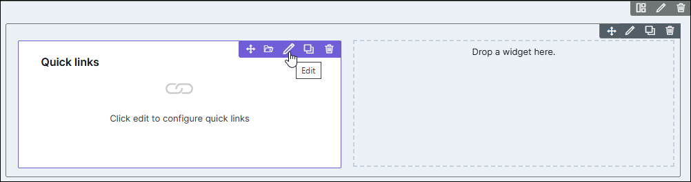 The Quicklinks Widget pop-up window opens with the Properties tab open by default.
 -
In the Quicklinks Widget window, under Properties, enter or
select the required field information.
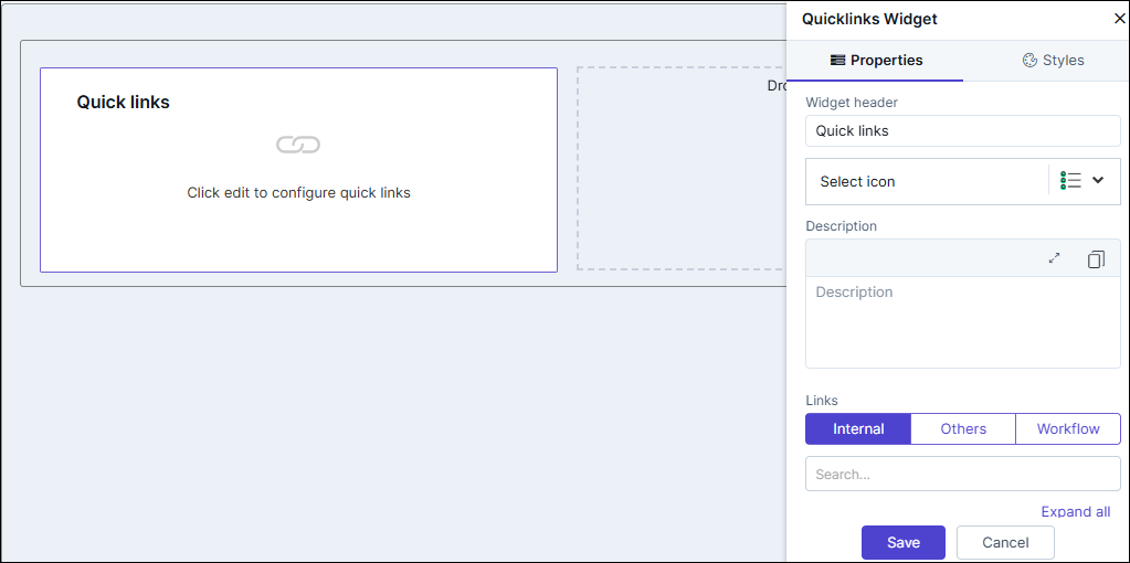
Table 1. Field descriptions for Properties Field Description Widget Header Provide a name for the Widget Header. For example: Quick Links. Select icon Select an icon for the Quick Links widget from the dropdown. Description Users can add a brief description for the widget to provide context or additional information. Add Links You can add three types of links here: - Internal: Users can choose from pre-packaged hyperlinks that are already available within the application.
- Others: In this option, users can add
two types of links: Internal and External.
- Internal: Links that navigate to specific locations within the application.
- External: Links that redirect to external web pages or resources outside the application.
- Workflow: Users can create links to specific service catalogs or workflows, allowing them to seamlessly access relevant workflows directly from the page.
- Click Save.
Adding an Internal Quick Link
- To link an internal AppviewX page to the widget, under Add links, click Internal.
-
To select a link to be added to the widget, click
 (Add) icon.
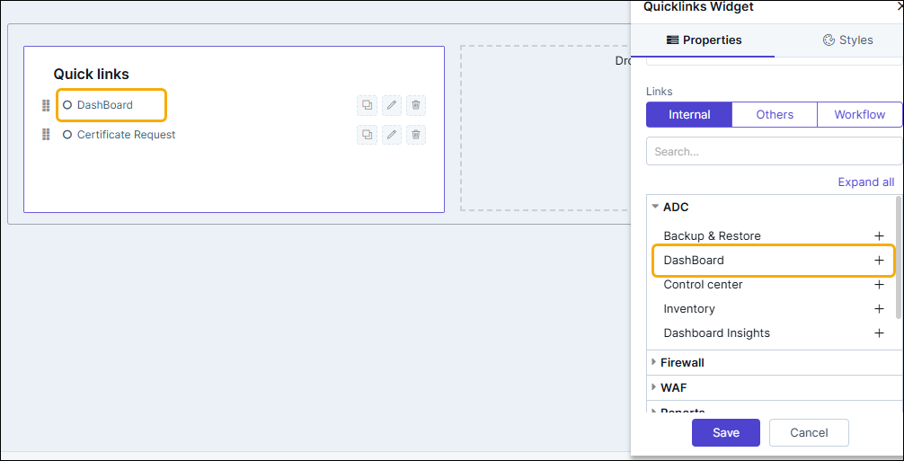
-
To add selected links to the widget, click Save.
Clicking on the quick link will redirect to the selected page in a new tab.
Adding Others Quick Links
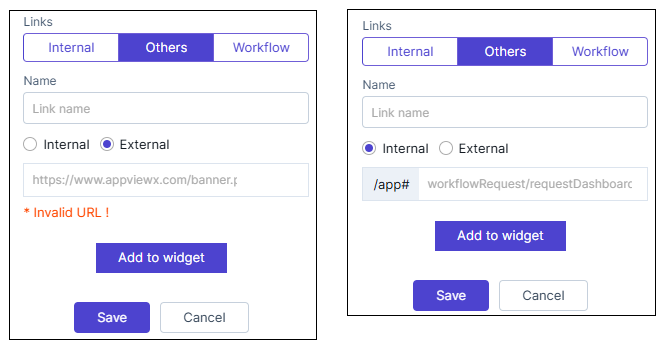
- To embed an Internal link or a cross origin enabled page URL into the Quick link widget, under Links, click Others.
-
Enter the Name and URL for the link.
-
Add the internal or external links as follows:
- Select the Internal radio button, and append the URL to /app# field. (these are the AppViewX configured URLs/pages)
- Select the External radio button and enter the complete URL in the field. example: www.google.com.
-
To add this external link to your widget, click Add to Widget.
Clicking on the quick link will redirect to the configured external page.
Adding a Workflow Quick Link
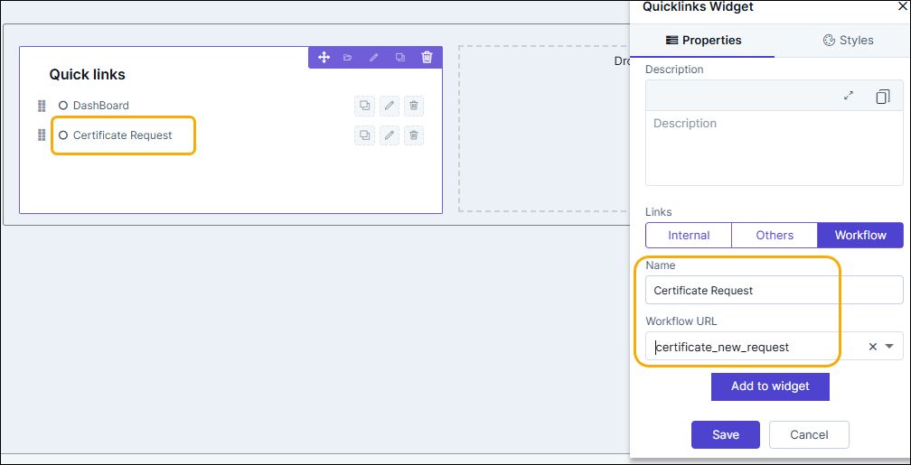
- To add a link to redirect to the Workflow Request execution page for the selected workflow, under Add links, click Workflow.
-
Enter the link Name and select the Workflow URL from the
dropdown.
-
To add this workflow URL to the Quick Links widget, click Add to
Widget.
Clicking on the quick link will redirect to the workflow request execution page of the selected workflow.
- Once you have added the required workflow URLs to the widget, click Save.
Configuring Quicklinks - Styles
-
For more options to customize the widget, in the Quicklinks Widget
window, click Styles.
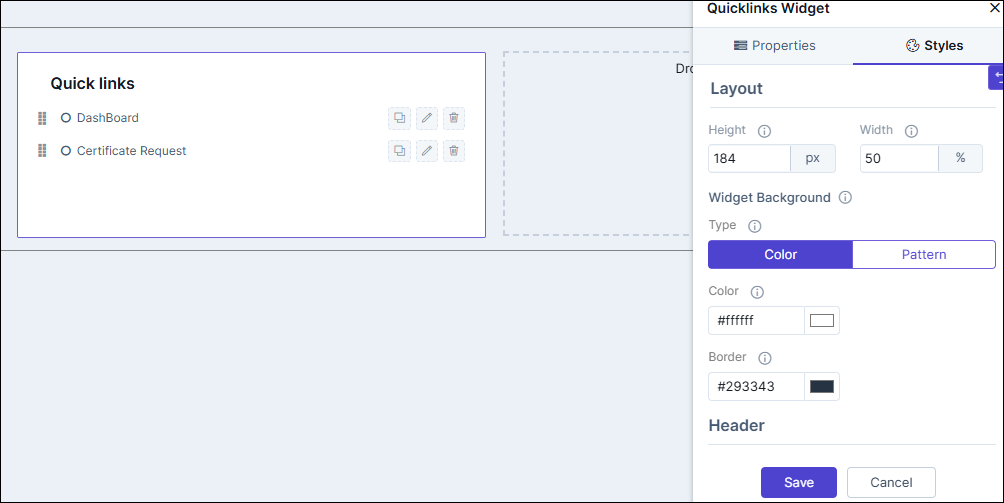
Table 2. Field descriptions for Styles Field Description Sizing Allows you to increase/decrease the height and width of the widget. Widget Background The following options are available here: - Add Background Pattern: To add a background pattern to the widget, select the Add Background Pattern checkbox and select a pattern from the available options.
- Widget Background Color: To add a background color to the widget, unselect the Add Background Pattern checkbox and select the color from the color palette.
- Widget Border Color: Allows you to change the color of the widget border.
Widget Header The following options are available here: - Header Text Color: Allows you to change the color of the header text.
- Header Text Size: Allows you to select the size of the header text.
- Header Text Underline: To underline the header text, select the Header Text Underline checkbox.
Widget Description The following options are available here: - Description Text Color: Allows you to change the color of the label text.
- Description Text Size: Allows you to select the size of the label text.
- Description Text Underline: To underline the description text, select the Description Text Underline checkbox.
Icon Style The following options are available here: - Icon Color - Select the Icon Color from the available options.
- Icon Background - Select the Icon Background from the available options.
- Icon Background Color - Select the Icon Background Color from the available options.
- To save your settings, click Save.
-
To restore the settings to default, click
 (Restore) icon.
Editing and Deleting Quick Links
Individual quick links can be edited to change the name displayed on the widget,
add help text to quick links, and also delete quick links from the widget.
-
To edit an internal or external Quick link click
 (Edit) icon.
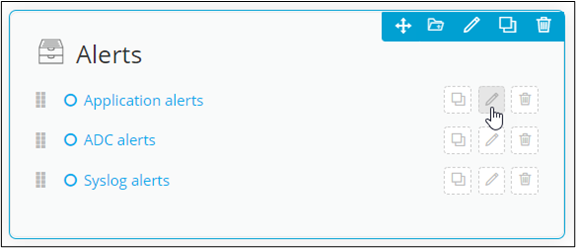
- Enter the Alias name in the quick link pop-up window.
-
To edit the Workflow quick link, click
(Edit) icon.
- In the workflow quick link pop-up window, edit the workflow name and select a different workflow URL from the dropdown list.
- To display the help text when you hover your mouse over a quick link, select the Help info checkbox and add the text to be displayed.
- Click Save.
-
To delete a quick link, click
 (Delete) icon and click Ok in the Confirmation window.
- To rearrange the order in which the quick links are displayed in the widget, hold and drag the quick link where required.
-
To make a copy of a quick link, click
 (Clone) icon.