Group
Configuring the Group Widget - Properties
-
From the Build component in the left menu, under the Widgets
section, drag and drop the Group widget to any blue highlighted
space on the page.
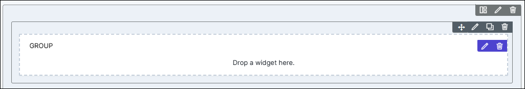
- Drag and drop related widgets into this Group component to view them all in one place.
-
To configure/edit the Group component, click
 (Edit) icon.
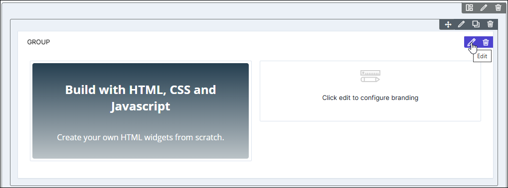 The Group pop-up window opens with the Properties tab open by default.
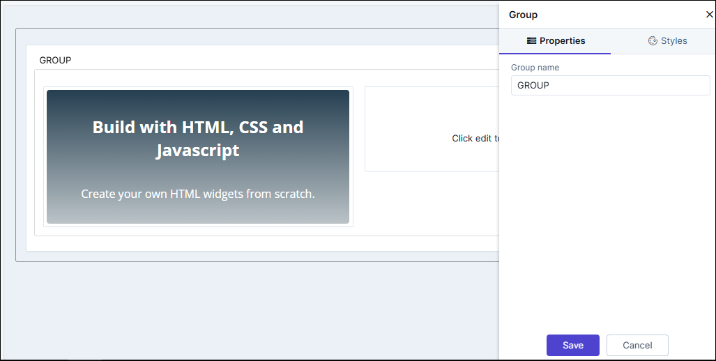
- In the Group window, under Properties, you can change the Group name.
- Click Save.
-
To configure individual widgets within the group, hover your mouse over the
specific widget and click
 (Edit) icon.
Configuring the Group Widget - Styles
-
For more options to customize the Group component, in the
Group window, click Styles.
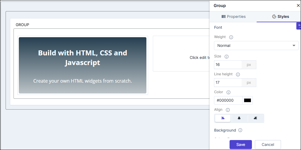
Table 1. Field descriptions for Styles Option Description Weight The Weight dropdown list lets you set the font thickness of the field label using one of the following values: - Default
- Light
- Normal
- Thick.
Size Allows you to increase/decrease font Size of the field name. Line height Allows you to increase/decrease the Line height of the field. This means the space between the field and the field border. Color Allows you to define the Color of the field label. Align Allows you to Align the field label to the left, center or right side of the field. Background Allows you to define the Background color for the HTML widget. Border Allows you to define the - Border color - Select the color of the layout border.
- Border style - Select the border style for the layout section from the options available in the dropdown.
- Border width - Select the thickness of the layout border.
- To save your settings, click Save.
-
To restore the settings under Styles to default, click
 (Restore) icon.