Branding
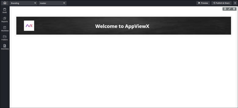
Configuring Branding - Properties
- From the Build component in the left menu, under the Widgets section, drag and drop the Branding widget to any blue highlighted space on the canvas.
-
To configure the Branding widget, hover your mouse over the widget and
click
 (Edit) icon.
 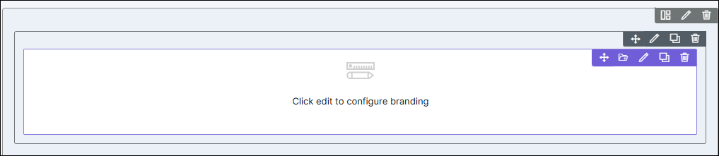 The Branding pop-up window opens with the Properties tab open by default.
 -
In the Branding window, under Properties, enter or select the
required fields.
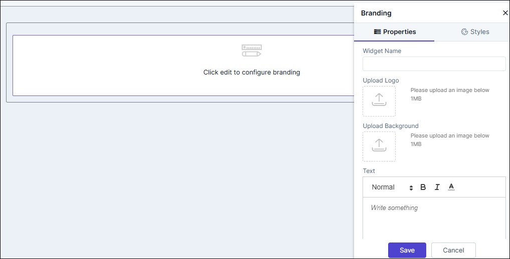
Table 1. Field descriptions for Properties Field Description Widget Name Enter a suitable widget name. For example, AppViewX. Upload Logo The branding or header widget allows users to upload their logo or any custom image that represents their personal brand. Upload Background Users can set a background image for the branding or header widget, adding a unique visual element to the page. Text In addition to the logo or image, users can add custom text to display in the header section, further conveying their brand message or tagline.
Configuring Branding - Styles
-
For more options to customize the widget, in the Branding window,
click Styles.
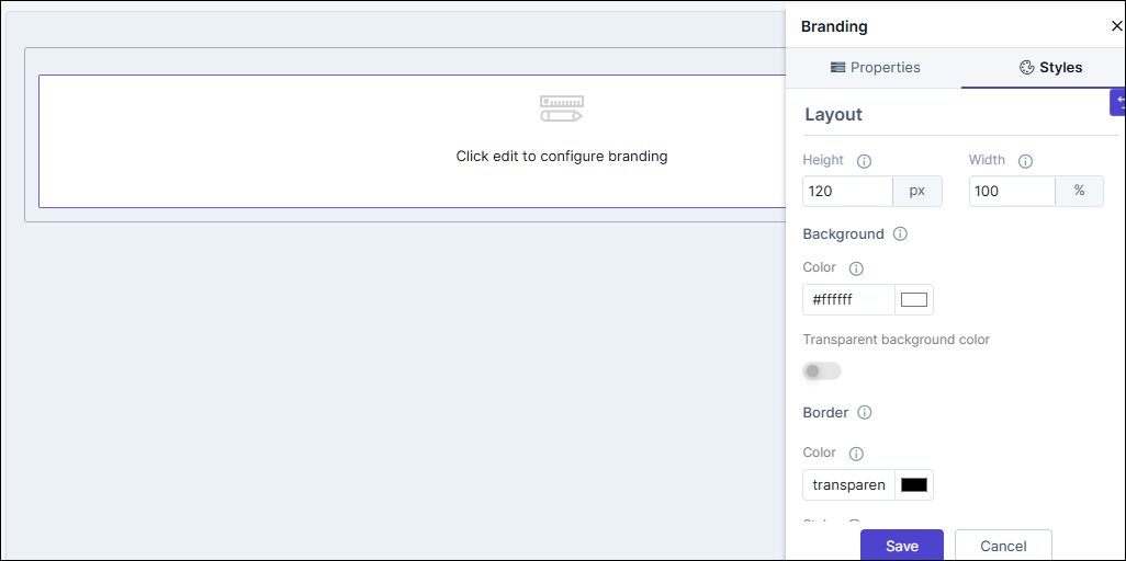
Table 2. Field descriptions for Styles Option Description Sizing Allows you to increase/decrease the height and width of the widget. Background The following options are available here: - Background color: Allows you to select a background color for the branding widget.
- Set transparent background color: To set the background color as transparent, turn on the toggle.
Border The following options are available here: - Border color: Allows you to select the border color.
- Border style: Allows you to select the border style from the options available in the dropdown, e.g. dotted, dashed, inset etc.
- Border width: Allows you to adjust the width of the border.
- Click Save.
- Drag and drop the background image and text to move it to any position within the widget and resize the company logo.
-
To restore settings to default, click
 (Restore) icon.