Layout
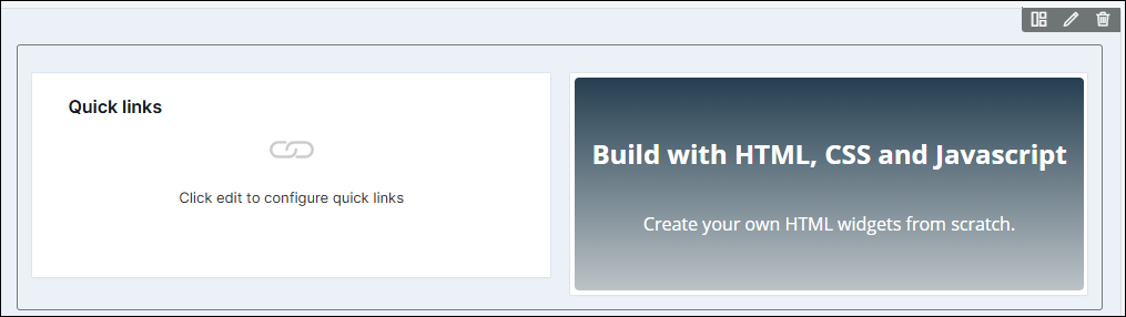
The Layout widget is a versatile tool that allows users to create a structured layout with two empty cells. This widget acts as a parent container for other widgets, providing users with a flexible canvas to arrange and organize their content.
- Separate a row into two columns at a time
- Insert more layouts within a layout for additional columns.
Adding a Layout Component
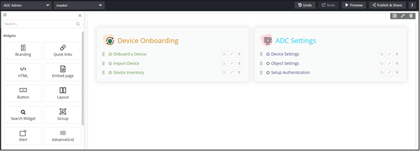
- Drag and drop the Layout component to any blue highlighted space on the page.
-
Drag and drop one or more component(s) into this Layout widget as
per your requirement.
Configuring the Layout Component
-
To configure/edit the Layout component, hover your mouse over the widget
and click
 (Edit) icon.
 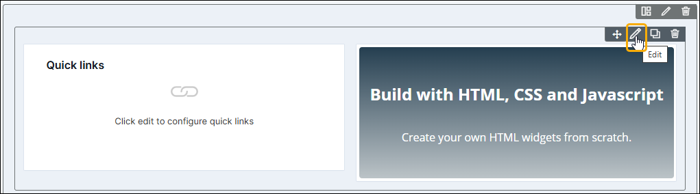 The Row pop-up window opens with the Styles tab.
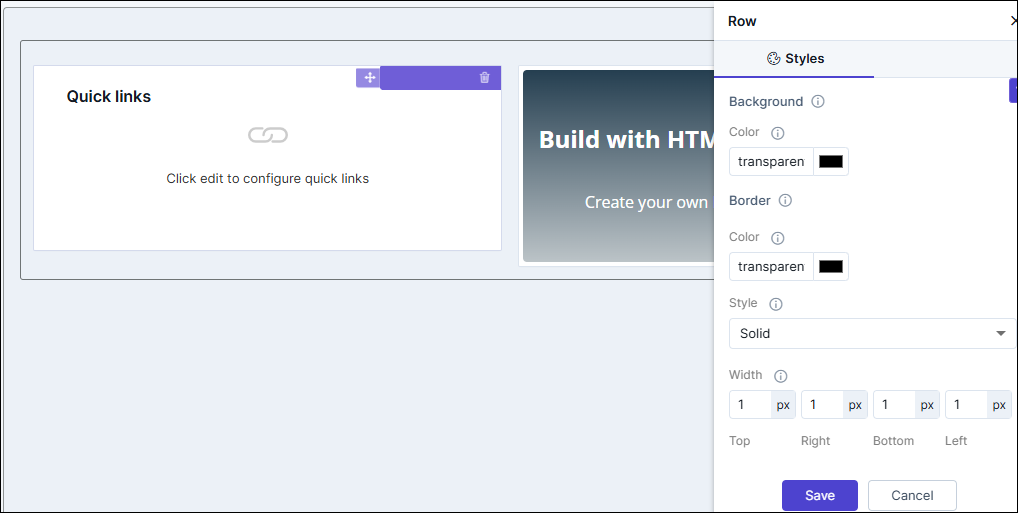
Table 1. Field descriptions for Styles Option Description Background Allows you to define the Background color for the Layout widget. Border Allows you to define the
- Border color - Select the color of the layout border.
- Border style - Select the border style for the layout section from the options available in the dropdown.
- Border width - Select the thickness of the layout border.
- To save your settings, click Save.
-
To restore the settings under Styles to default, click
 (Restore) icon.