Button (Action Widget)
Configuring the Button/Action Widget - Properties
- From the Build component in the left menu, under the Widgets section, drag and drop the Button widget to any blue highlighted space on the page.
-
To configure the button/action widget, hover your mouse over the widget and
click
 (Edit) icon.
 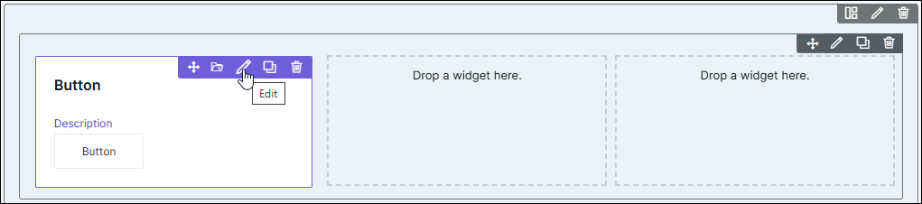 The Button pop-up window opens.
 -
In the Button pop-up window, under Properties, enter or select the
required fields.
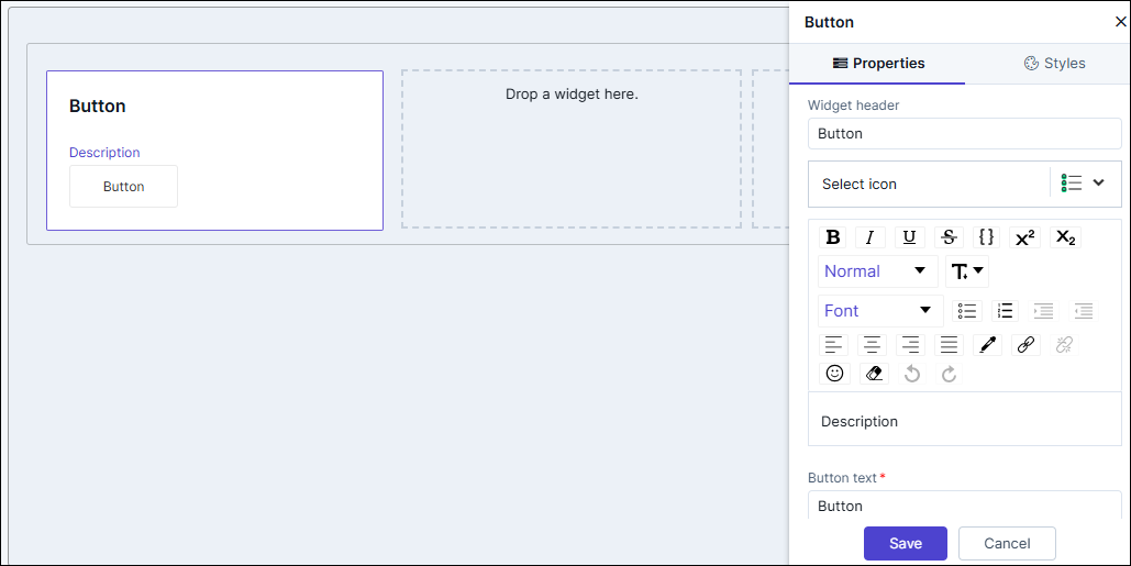
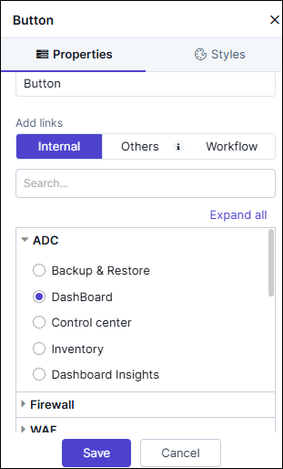
Table 1. Field descriptions for Properties Field Description Widget Header Allows you to enter the widget header name. Select icon Allows you to select the icon for the widget from the options available in the dropdown. Description Allows you to add a description for the action widget. Button text Allows you to add the text that is displayed on the button. Add links Allows you to add links to the action widget. The following options are available here: - Internal: Add an internal from within AppViewX pages.
- Others: Add links to other pages within AppViewX or embed external cross origin enabled pages.
- Workflow: Add a workflow link which redirects to the workflow execution page.
- Click Save.
Adding an Internal Action Widget Link
- To link an internal AppviewX page to the action widget, under Add links, click Internal.
-
Select the required internal link from the list.
-
Click Save.
Clicking on the button will redirect to the selected link in a new tab.
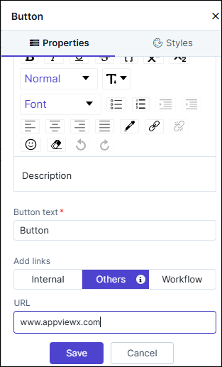
Adding an Others/External Widget Link
- To embed an external link or a cross origin enabled page URL into the Action widget, under Add links, click Others.
-
Enter the Name and URL for the link.
-
Click Save.
Clicking on the button will redirect to the page as per the configured URL.
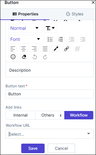
Adding a Workflow Link to the Widget
- To add a link to redirect to the Workflow Request execution page for the selected workflow, under Add links, click Workflow.
-
Enter the link Name and select the Workflow URL from the
dropdown.
-
Once you have selected the required workflow URL to the action widget,
click Save.
Clicking on the button will redirect to the workflow request execution page for the configured workflow URL.
Configuring the Button/Action Widget - Styles
-
For more options to customize the action widget, in the Button
window, click Styles.
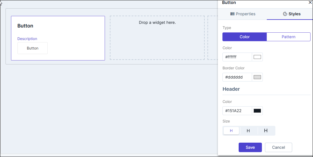
Table 2. Field descriptions for Styles Option Description Sizing Allows you to increase/decrease the width of the action widget. Widget Background The following options are available here:
- Add Background Pattern: To add a background pattern to the widget, select the Add Background Pattern checkbox and select a pattern from the available options.
- Widget Background Color: To add a background color to the widget, unselect the Add Background Pattern checkbox and select the color from the color palette.
- Widget Border Color: Allows you to change the color of the widget border.
Widget Header The following options are available here:
- Header Text Color: Allows you to change the color of the header text.
- Header Text Size: Allows you to select the size of the header text.
- Header Text Underline: To underline the header text, select the Header Text Underline checkbox.
Widget Description The following options are available here:
- Description text Color: Allows you to change the color of the label text.
- Description Text Size: Allows you to select the size of the label text.
- Description Text Underline: To underline the description text, select the Description Text Underline checkbox.
Widget Type Allows you to enable/disable the button in the action widget.
- To enable the button select the Enable button checkbox.
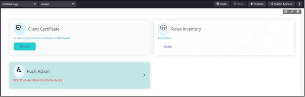
- To disable the button, deselect the Enable button checkbox. The action widget is displayed in a card view. Click on the widget to redirect to the page that is linked to the widget.
Button Background This feature is available only when the button is enabled. The following options are available here:
- Button Corners: Allows you to define the curvature of the button corners. The higher the number, the corners will be curved more.
- Button Alignment: Allows you to define the placement of the button in the action widget - left, center, and right.
- Widget Background Color: Allows you to select the background color of the widget from the color palette.
- Widget Border Color: Allows you to select the color of the widget border from the color palette.
Button Text This feature is available only when the button is enabled. The following options are available here:
- Button Text Alignment: Allows you to define the placement of the button text inside the button - left, center, and right.
- Button Text color: Allows you to select the button text color from the color palette.
- Text Size: Allows you to select the size of the text displayed on the button.
Icon Style The following options are available here: - Icon Color - Select the Icon Color from the available options.
- Icon Background - Select the Icon Background from the available options.
- Icon Background Color - Select the Icon Background Color from the available options.
- To save your settings, click Save.
-
To restore the settings under Styles to default, click
 (Restore) icon.