Designing a Custom Stacked Bar Chart
To design a custom stacked bar chart:
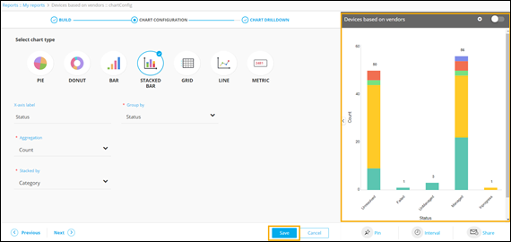
- Build a report.
- Under the CHART CONFIGURATION section, select the STACKED BAR chart.
-
Enter or select the required field information.
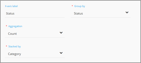 The following table describes the field information in this section:
Field Description X-axis label Enter the criteria for the X-axis label. For example: Status. *Group by Select a value from the drop down menu on the basis of which report data will be grouped. For example: Status. *Aggregation Select the calculation to be done on the report data for the dropdown. The following options are available: - Average: Calculates the average value of a given set of data.
- Sum: Calculates the sum of all values in a given set of data.
- Count: Calculates the total number of items in a given numeric field.
- Maximum: Displays the maximum value in a given set of data.
- Minimum: Displays the minimum value in a given set of data.
*Stacked by Select the parameter from the drop down menu on the basis of which the data will be stacked in the chart. For example: Category of device. * : Mandatory fields -
Click Save.
A preview of the stacked bar chart is generated on the right side of the screen.
-
To select the data loading pattern, in the chart's preview window, click
 (Settings) icon.
The following options are displayed:
(Settings) icon.
The following options are displayed:- Instant: This option allows you to enable live data loading and see changes in data immediately. This can be used in the case of small databases.
- Deferred: This option allows you to enable lazy data loading and is useful in the case of larger databases. The default time interval for this is set at 30 minutes.
-
To change the style/font color of the stacked bar chart, click
Styles.
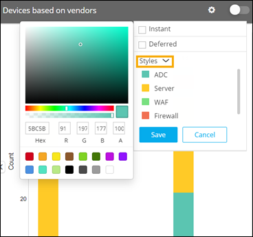
- Click on the coloured value boxes to display the color palette.
- Choose the desired color.
- Similarly click the coloured boxes and choose different colors from the palette for the different values,
- Click Save.
- Enable the toggle button to view the applied changes.
- To enable the report, turn on the toggle. Only enabled reports are visible on the dashboard to which they are pinned.
-
Click Next.
The CHART DRILLDOWN section is displayed.