Designing a Custom Metric Chart
To design a custom metric chart:
- Build a report.
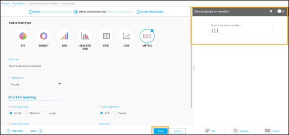
- Under the CHART CONFIGURATION section, select the METRIC chart.
-
Enter or select the required field information.
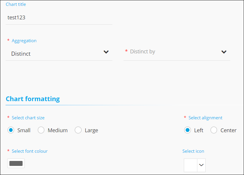
The following table describes the field information in this section:
Field Description Chart Title Enter the chart title. For example: Devices based on vendors. *Aggregation Select the calculation to be done on the report data for the dropdown. The following options are available: - Average: Calculates the average value of a given set of data.
- Sum: Calculates the sum of all values in a given set of data.
- Count: Calculates the total number of items in a given numeric field.
- Maximum: Displays the maximum value in a given set of data.
- Minimum: Displays the minimum value in a given set of data.
- Distinct: Displays the number of distinct or unique values as specified in the Distinct by field.
*Select chart size Select the metric size. For example, Small. *Select alignment Select the placement of the metric on the screen. For example: Left. *Select font color Select the color of the font on the metric. Select icon Select an icon for the metric chart from the dropdown menu. * : Mandatory fields -
Click Save.
A preview of the metric chart is generated on the right side of the screen.
-
To select the data loading pattern, in the chart's preview window, click
 (Settings) icon.
The following options are displayed:
(Settings) icon.
The following options are displayed:- Instant: This option allows you to enable live data loading and see changes in data immediately. This can be used in the case of small databases.
- Deferred: This option allows you to enable lazy data loading and is useful in the case of larger databases. The default time interval for this is set at 30 minutes.
-
To enable the report, turn on the toggle. Only enabled reports are visible on
the dashboard to which they are pinned.
Note: Color code mapping is not applicable to the metric chart.
-
Click Next.
The CHART DRILLDOWN section is displayed.