Usage and Adoption Metrics Dashboard
The Usage and Adoption Metrics dashboard displays predefined widgets to provide the AppViewX metric usage reports and up-to-the-minute reports. It contains the status and statistics of devices and certificates managed within the AppViewX platform. It displays reports related to user summary, logins, user activity, asset inventory and more.
| Options | Description |
|---|---|
| Dashboard name | Displays the name of the current dashboard. |
 |
Allows you to navigate to the Dashboard inventory. |
 |
Allows you to create a dashboard/widget. |
 |
Allows you to save the dashboard. |
 |
Allows you to export the dashboard. |
 |
Allows you to download the dashboard to your laptop. |
 |
Allows you to schedule and email reports from the dashboard. |
 |
Allows you to align the widgets on the dashboard. |
 |
Refreshes the dashboard. |
Following are the various reports and metrics that are available on this dashboard:
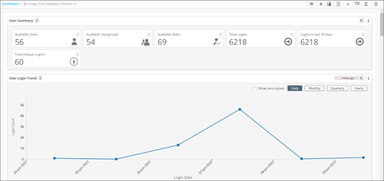
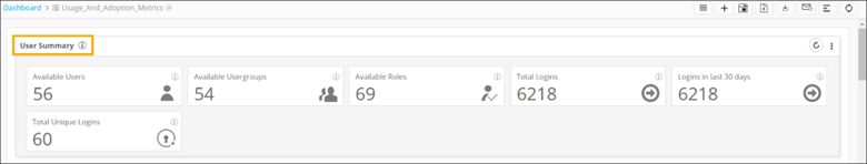
- The User Summary report gives a snapshot of
user login, summary, and trends.
The following table describes the metrics displayed in this widget:
Metric Description Available Users This metric displays available users in AppViewX. Available User Groups This metric displays available user groups in AppViewX. Available Roles This metric displays the available roles in AppViewX. Total Logins This metric displays the total number of logins in AppViewX. Logins in last 30 days This metric displays the number of logins in the last 30 days. Total Unique Logins This metric displays the total unique logins from different IDs. - The User Login Trend report displays the date-wise count
of logins in AppViewX.
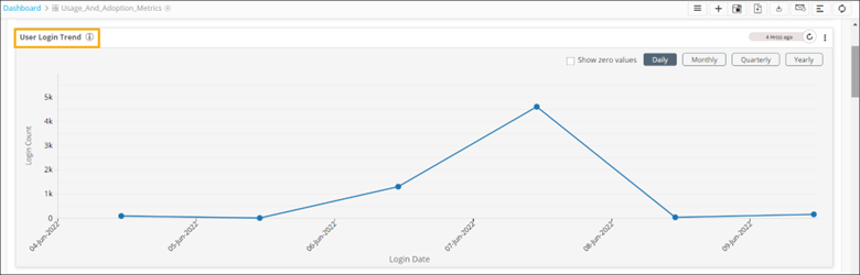 Note: The default selection is set to Daily.
- To display dates on which there were zero logins into AppViewX, select
the Show zero values checkbox.
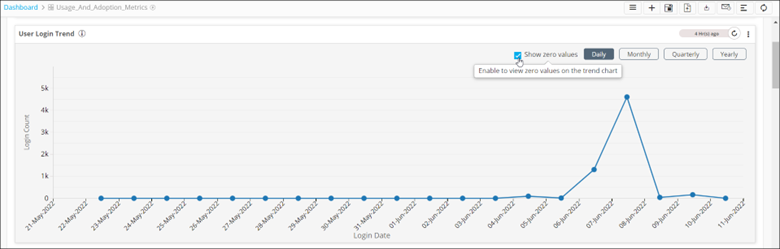
- Select Monthly, Quarterly, and Yearly options to get data based on the respective timelines.
- To display dates on which there were zero logins into AppViewX, select
the Show zero values checkbox.
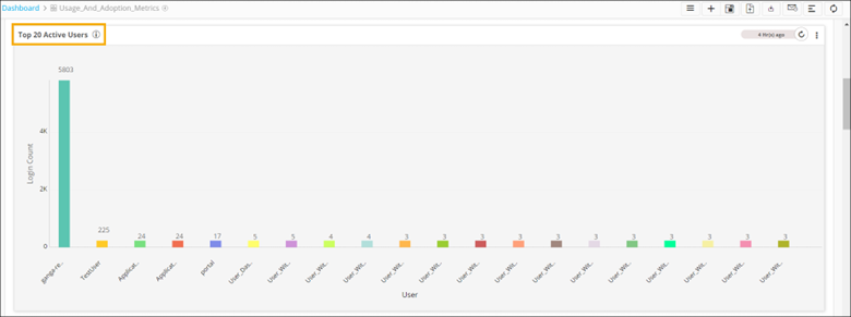
- The Top 20 Active Users chart displays the top 20 active
users by login count.
- The API_vs_Manual:Overall_Actions pie chart
shows the list of actions triggered either manually or via API.
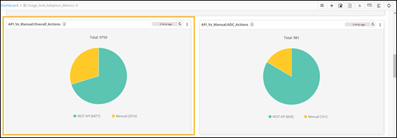
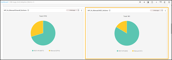
- The API_vs_Manual:ADC_Actions pie chart shows
the list of ADC actions triggered either manually or via API.
- The Asset Inventory widget displays the
inventory of different types of assets such as ADC, firewall, and WAF.
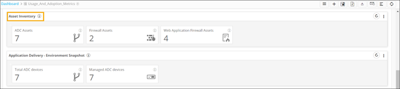
The following table describes the metrics displayed on this widget:
Metric Description ADC Assets This metric displays the total count of all available ADC devices. Firewall Assets This metric displays the total count of all available Firewall devices. Web Application Firewall Assets This metric displays the total count of all available WAF devices. - To drill down a chart to display more levels of information, click any
metric.
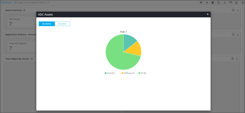
- To drill down a chart to display more levels of information, click any
metric.
- The Application Delivery - Environment Snapshot
widget displays a snapshot of application delivery. Each metric displays the
total count of respective devices.
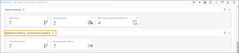
The following table describes the metrics displayed on this widget:
Metric Description Total ADC devices This metric displays the total count of all available ADC devices. Total Application Service Objects This metric displays the total application service objects. Managed ADC devices This metric displays all the managed ADC devices. - To drill down a chart to display more levels of information,
click any metric.
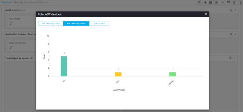
- To drill down a chart to display more levels of information,
click any metric.
- The Total Object by Vendor pie chart displays
the count of all ADC objects by vendor.
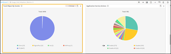
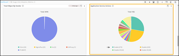
- The Application Service Actions pie chart shows
a snapshot of application services performed.
- The Certificate - Environment Snapshot widget
displays a snapshot of managed and monitored certificates.
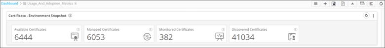
The following table describes the metrics displayed on this widget:
Metric Description Available Certificates This metric displays the total count of all available certificates. Managed Certificates This metric displays the total count of all managed certificates. Discovered Certificates This metric displays the total count of all discovered certificates. - To drill down a chart to display more levels of information,
click any metric.
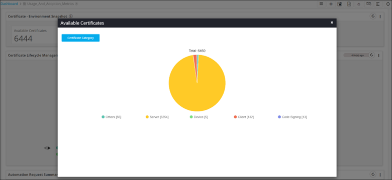
- To drill down a chart to display more levels of information,
click any metric.
- The Certificate Lifecycle Management pie chart
displays a snapshot of certificate actions performed, such as certificate push,
certificate rollback, certificate push and bind and so on.
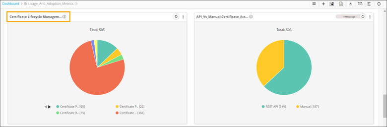
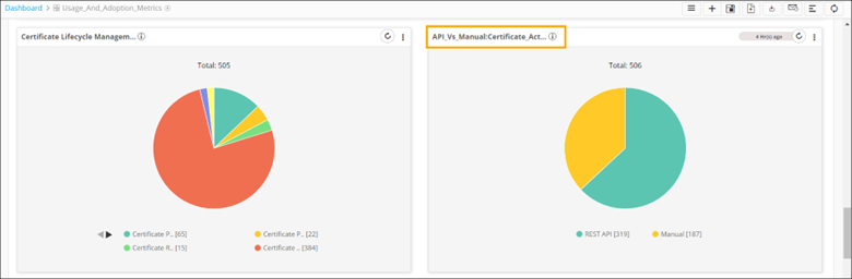
- The API_vs_Manual:Certificate_Actions pie chart
shows a list of certificate actions triggered either manually or via API.
- The Automation Request Summary widget displays
a snapshot of automation request status and trend.
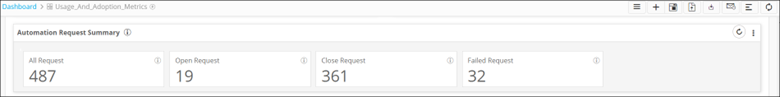
The following table describes the metrics displayed in this widget:
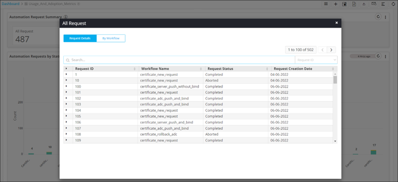
Metric Description All Request This metric displays the count of total workflow automation requests. Open Request This metric displays the count of open workflow automation requests. Close Request This metric displays the count of closed workflow automation requests. Failed Request This metric displays the count of failed workflow automation requests. - To drill down a chart to display more levels of information,
click any metric.
- To drill down a chart to display more levels of information,
click any metric.
- The Automation Request by Status stacked bar
graph displays the request status by workflow.
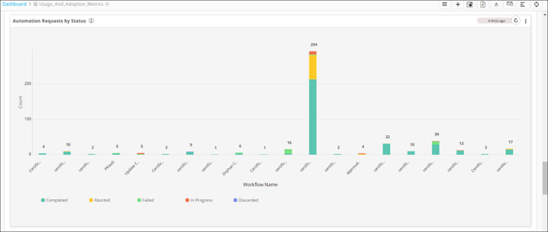
- To drill down a chart to display more levels of information,
click any metric.
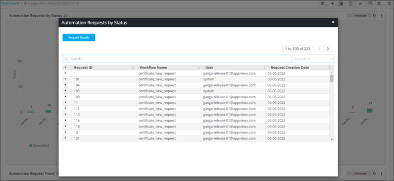
- To drill down a chart to display more levels of information,
click any metric.
- The Automation Request Trend line chart
displays the trend of all automation requests.
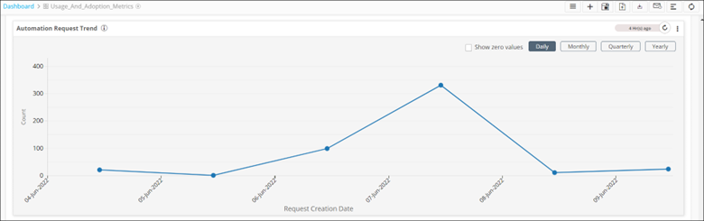
- To display dates on which there were zero logins into
AppviewX, select the Show zero values
checkbox.
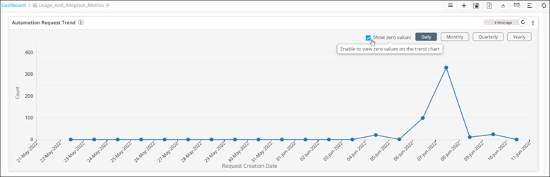
- To get data based on the respective timelines, click Monthly, Quarterly, and Yearly buttons.
- To display dates on which there were zero logins into
AppviewX, select the Show zero values
checkbox.
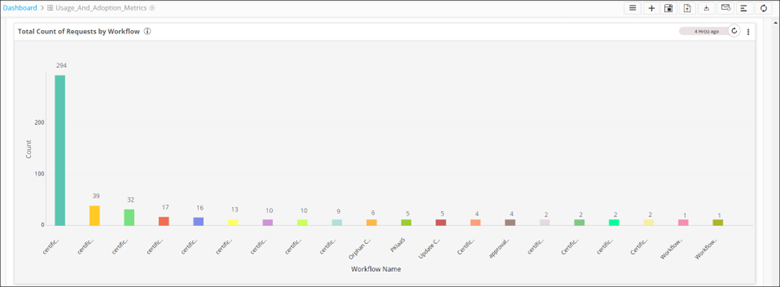
- The Total Count of Requests by Workflow bar
graph displays the total count of requests by workflow.
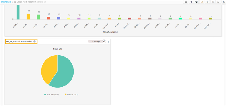
-
The API_vs_Manual:Automation pie chart displays a list of automation requests triggered either manually or via API.