Modifying page layout - Styles
-
For more options to customize the page layout, in the Layout window, click
Styles.
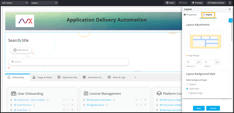
- Under Layout Adjustments, increase/decrease the Page Margin at the sides and the bottom.
-
To see the changes reflected on the page, click Save and then click
Preview.
The Page Margin settings have been applied to the left, right, and bottom of the page.
 Note: Page margins are not applicable between individual widgets.
 -
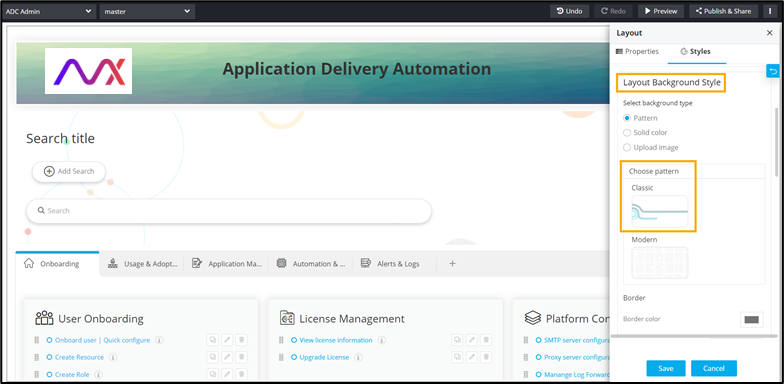
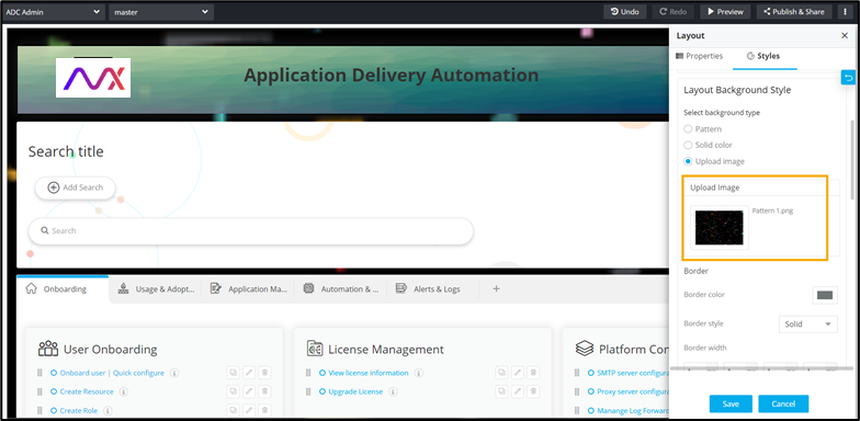
Under Layout Background Style, to change the background, Select background
type from the available options.
- Pattern - Select the Pattern option to choose a pattern from the
options displayed.
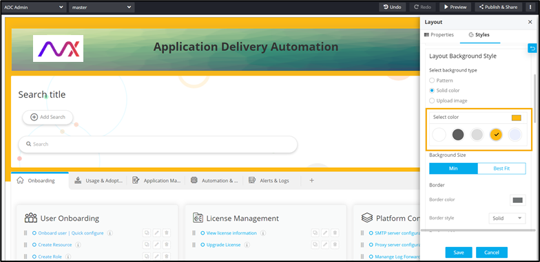
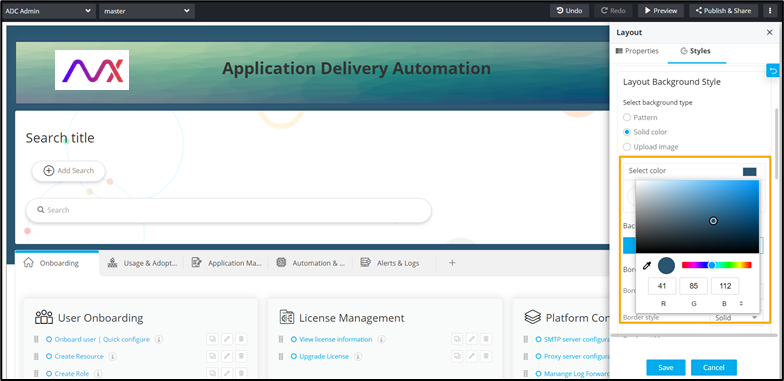
- Solid color - Select the Solid color option to choose a solid color
either from the options displayed or from the color picker.
- Upload image - Select the Upload image option to upload an image from your
machine as the background image.
- Pattern - Select the Pattern option to choose a pattern from the
options displayed.
-
Under Background Size, to set the background color to only a part of the page,
select Min.
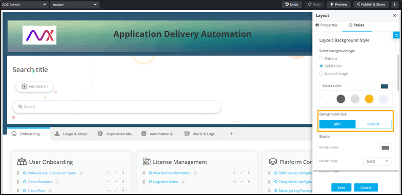 Note: This feature is applicable only when the background type is selected as Solid color.
 -
Under Background Size, to set the background color for the entire page, select
Best Fit.
Note: This feature is applicable only when the background type is selected as Solid color.
-
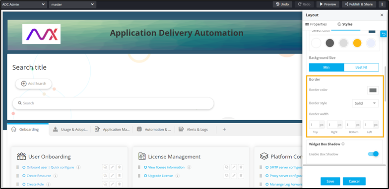
Under Border section, you can customize the following:
- Border color - Select the border color from the color picker. The selected color is applied to the page border.
- Border style - Select the border style from the options displayed in the dropdown.
- Border width - Select the width of the border at the top, right, bottom,
and left of the page.
- Under Widget Box Shadow, to remove the shadow for all widgets on the page, turn off the Enable Box Shadow toggle.
-
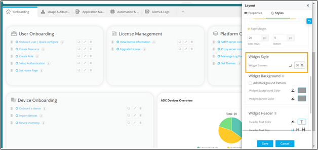
Under Widget Style, increase/decrease the curvature of the Widget
corners.
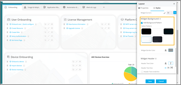
- Under Widget Background, to add a background pattern, select the Add Background Pattern checkbox.
-
Select a pattern from the options available.
The selected pattern is applied to all the widgets on the page.
-
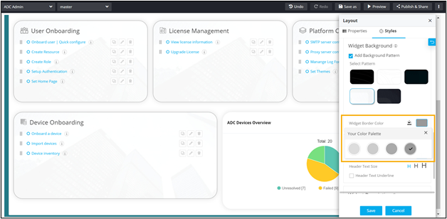
Select the Widget Border Color from the color picker
 or the color palette.
-
Under Widget Background, select the Widget Background Color from the
color picker or the color palette.
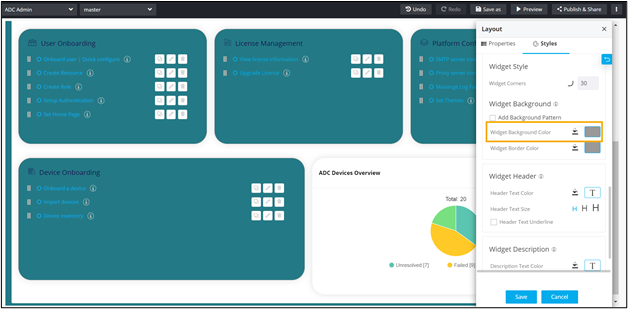 Note: The Widget Background Color option is displayed only when the Add Background Pattern checkbox is not selected.
 -
Under the Widget Background section, select the Widget Border Color from
the color picker or the color palette.
-
Under the Widget Header section, the following options are available:
- Header Text Color - Select the Header Text Color from the color
picker or the color palette.
- Header Text Size - Select the Header Text Size from the available options.
- Header Text Underline - Select the Header Text Underline checkbox to
underline the Header Text.
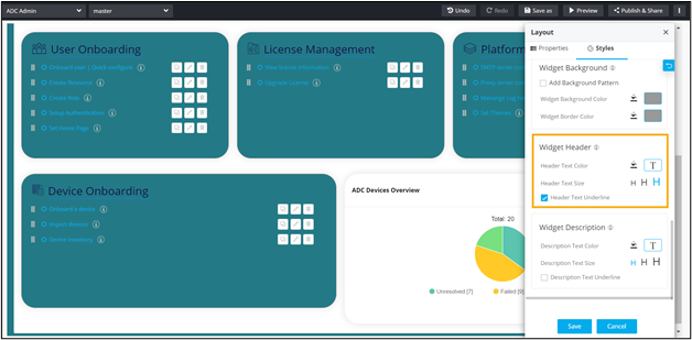 Note: Widget Header style changes are applicable to only those widgets that have a widget header.
- Header Text Color - Select the Header Text Color from the color
picker
-
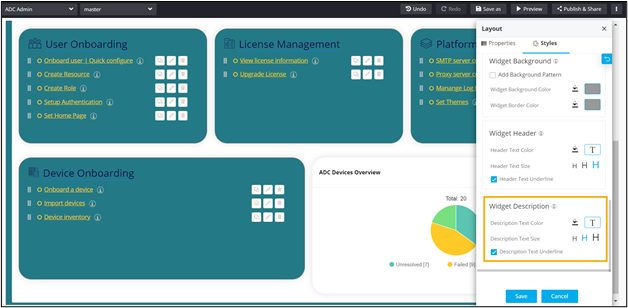
Under the Widget Description section, the following options are available:
- Description Text Color - Select the Description Text Color from the
color picker or the color palette.
- Description Text Size - Select the Description Text Size from the available options.
- Description Text Underline - Select the Description Text Underline
checkbox to underline the Header Text.
 Note: Widget Header style changes are applicable to only those widgets that have a widget header.
- Description Text Color - Select the Description Text Color from the
color picker
-
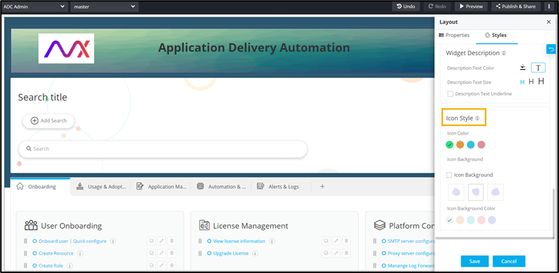
Under the Icon Style section, choose from the following available options:
- Icon Color - Select the Icon Color from the available options.
- Icon Background - Select the Icon Background from the available options.
- Icon Background Color - Select the Icon Background Color from the available
options.