Creating a Policy for Device Onboarding
-
Go to
 .
The Policy Inventory page is displayed with all policies displayed for Kube, Certificate, and Device.
.
The Policy Inventory page is displayed with all policies displayed for Kube, Certificate, and Device. -
Click (+Create Policy).
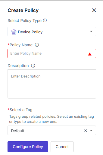
The Create Policy pop-up is displayed.
-
In the Create Policy pop-up, from the Select the Policy Type
dropdown, select Device Policy.
The fields for creating the device policy are displayed.
-
Enter/Select values for configuring the policy as described in the table
below.
Field Description *Policy Name Enter a policy name that can include alphabets, numbers, and the special characters - (dash), _ (underscore). Description Enter a description for the policy. *Select a Tag Select an existing tag or type to create a new one. Tags group the related policies. Note: Selecting the appropriate policy type allows you to group policies logically, simplifying organization and management based on specific criteria.*: Mandatory field -
Click Configure Policy.
The Create a Device Onboarding Policy in 7 Simple Steps pop-up is displayed with a short description of each step.
-
Click Close on the pop-up.
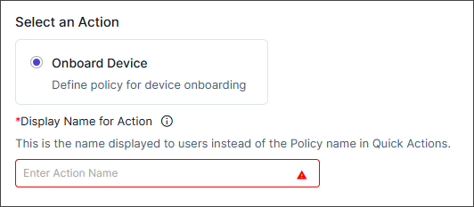
The first of the seven steps, Action is enabled.
Selecting Action
-
Enter/select the values as described in the table below.
Field Description Select an Action The Onboard Device option is selected by default (This is the policy for device onboarding) *Display Name for Action Enter the action name that is to be displayed to users instead of the Policy name in Quick Actions. This field accepts alphanumeric values and special characters - (dash), _ (underscore), and space. Click the info icon to preview the Quick Actions.
*: Mandatory field -
Click Next.
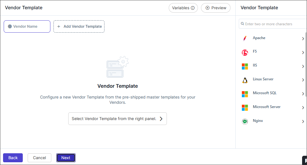
The second step, the Vendor Template page is displayed.
Configuring Vendor Template
-
Select a Vendor Template from the right panel.
A pre-shipped master template is displayed in the right panel.
-
Select the desired template.
The blank template form is displayed. This page displays the vendor templates to configure default parameters for vendor-specific onboarding.Currently, the following vendors are supported:
- Linux Server
- Microsoft Server (MSServer, Exchange Service, Windows Gateway)
- IIS
- MS SQL
- F5 (ADC)
- Apache (Linux and Windows)
- Tomcat (Linux and Windows)
- Nginx (Server)
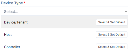
Note:- While entering values for multi-select fields, it is
mandatory to make any one of the values as default, by
clicking the Select & Set Default button next to
the value. See the image below.
- Each field type text-box, multi-select, dropdown, checkbox
and others can be customized by selecting the
 (settings) icon next to the field. See to the section
Field
Customizations for more details
(settings) icon next to the field. See to the section
Field
Customizations for more details
- Enter field information for the vendors as described here.
-
[Optional] Click
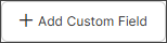 button to include additional custom
fields.
The Add Custom Field pop-up is displayed.
button to include additional custom
fields.
The Add Custom Field pop-up is displayed. -
Enter/Select the values in the Add Custom Field pop-up as described
in the table below.
Field Description Include this Custom Field as a Device Attribute Enable or disable the toggle button to include or exclude the custom field as a device attribute. Store this field value in an encrypted format Enable or disable the toggle button to store the field value in an encrypted or non-encrypted format. *Field Name Provide a field name for the custom field in alphanumeric format. *Field Type Select a field type for the custom field. The available types are: - Label
- Text Box
- Text Area
- Radio Button
- Checkbox
- Select Box
- Multi-select Box
Field Value Specify a default value for the field. The value can be modified according to the field type. For fields that accept multiple entries, use a comma-separated format. *: Mandatory field -
Click the Add button in the Add Custom Field pop-up to enable
the value in the Vendor Template form.
Note: After adding custom fields, a(Settings) icon will appear to customize the
field type, and a
 (Delete) icon will be available to remove the field from the
form.
(Delete) icon will be available to remove the field from the
form. -
Click
 (Preview) to view the form
information.
Note: Users can copy predefined variables (e.g., ${user.firstName}, ${user.lastName}) from the
(Preview) to view the form
information.
Note: Users can copy predefined variables (e.g., ${user.firstName}, ${user.lastName}) from the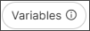 option, next to Preview. Variables can be inserted into text content and
at runtime, they are replaced with actual values.
option, next to Preview. Variables can be inserted into text content and
at runtime, they are replaced with actual values. -
Click the Save Template dropdown next to the Vendor Template
header, then select Save as New to create a new template and save
this configuration as a reusable template for future use.
The Save as Template pop-up is displayed.
- Enter the Template Name and enter a template Description. (Template names can include alphanumeric and the - (dash), _ (underscore), and space special characters.)
-
Click Save on the pop-up.
The Vendor template is saved successfully.
-
[Optional] Add another template, if required. Click
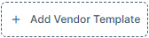 and follow the steps above.
-
Click Next.
The third step, the Approval page is displayed.
Field Customizations for Vendor Templates
-
Label
There is no customization for labels.
-
Text Box - The customizations fields for Text Box are as
follows:
Field Description Hide Field Enable the toggle button to hide the field in the form. Read Only Enable the toggle button to make the field a read-only (non-editable) one. Set as mandatory Enable the toggle button to make the field mandatory. Label name Enter a name for the field that will appear on the form. Place holder Enter the temporary text displayed inside the text box before the user enters any value. It provides a hint or example of what the user should type in that field. Validation Select or enter the customRegEx. Validation defines the rules that the input must meet before it can be submitted. Help Tooltip Enter the informational message that appears when the user hovers over or clicks on the information icon next to the field. Note: If any one of the toggle buttons are enabled Hide Field, Read Only, or Set as mandatory, then the other two toggle buttons remain disabled. -
Text Area - The customizations fields for Text Area are as
follows:
Field Description Hide Field Enable the toggle button to hide the field in the form. Read Only Enable the toggle button to make the field a read-only (non-editable) one. Set as mandatory Enable the toggle button to make the field mandatory. Label name Enter a name for the field that will appear on the form. Help Tooltip Enter the informational message that appears when the user hovers over or clicks on the information icon next to the field. -
Radio Button - The customizations fields for Radio Button are as
follows:
Field Description Hide Field Enable the toggle button to hide the field in the form. Read Only Enable the toggle button to make the field a read-only (non-editable) one. Set as mandatory Enable the toggle button to make the field mandatory. Label name Enter a name for the field that will appear on the form. Help Tooltip Enter the informational message that appears when the user hovers over or clicks on the information icon next to the field. -
Checkbox - The customizations fields for Checkbox are as
follows:
Field Description Hide Field Enable the toggle button to hide the field in the form. Read Only Enable the toggle button to make the field a read-only (non-editable) one. Set as mandatory Enable the toggle button to make the field mandatory. Label name Enter a name for the field that will appear on the form. Help Tooltip Enter the informational message that appears when the user hovers over or clicks on the information icon next to the field. -
Select Box - The customizations fields for Select Box are as
follows:
Field Description Hide Field Enable the toggle button to hide the field in the form. Read Only Enable the toggle button to make the field a read-only (non-editable) one. Set as mandatory Enable the toggle button to make the field mandatory. Label name Enter a name for the field that will appear on the form. Help Tooltip Enter the informational message that appears when the user hovers over or clicks on the information icon next to the field. -
Multi-select Box - The customizations fields for Multi-select
Box are as follows:
Field Description Hide Field Enable the toggle button to hide the field in the form. Read Only Enable the toggle button to make the field a read-only (non-editable) one. Set as mandatory Enable the toggle button to make the field mandatory. Label name Enter a name for the field that will appear on the form. Help Tooltip Enter the informational message that appears when the user hovers over or clicks on the information icon next to the field.
Setting Approval
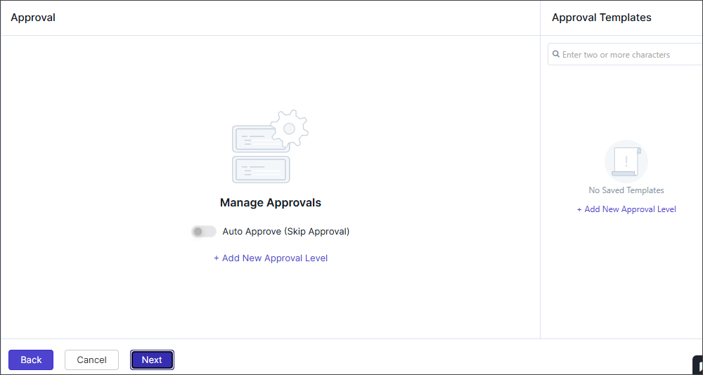
Auto-Approval
- Enable the Auto Approve (Skip Approval) toggle button.
-
Click Next.
The fourth step, Pre-onboarding page is displayed.
Adding New Approval Level
-
Click + Add New Approval Level
The Configure Approval pop-up is displayed with the Approval Settings tab (selected by default) and the Email Template tab.
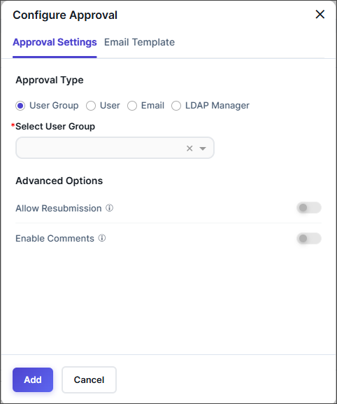
-
From the Approval Settings tab, configure the Approval Settings
based on the Approval Type radio button selection as described
below.
-
From the Email Template tab, enter/select the information as
follows:
Field Description Template Name Choose an email template to customize approval notifications Email Templates Enable the toggle buttons to use any of the templates below: - Approval Request Template
- Approval Confirmation Template
- Approval Rejection Template
To customize the email templates,
- Enable the toggle button of the respective email template
- Click the arrow icon next to the toggle button to expand/display the email contents.
- Edit the Email Subject,
CC (Carbon Copy), and Email Content.
Note: Users can copy predefined variables (For example: ${user.firstName}, ${user.lastName}) from theoption on the top-right of
the pop-up. Variables can be inserted into text
content and at runtime, they are replaced with
actual values.
*: Mandatory field -
Click Add.
The Approval template is displayed with the Edit and Delete icons and the option to further Add New Approval levels.
-
Click the Save Template dropdown next to the Approval
header, then select Save as New to create a new template and save
this configuration as a reusable template for future use.
The Save as Template pop-up is displayed.
- Enter the Template Name and enter a template Description. (Template names can include alphanumeric and the - (dash), _ (underscore), and space special characters.)
-
Click Save on the pop-up.
The Approval level template is saved successfully.
-
Click Next.
The fourth step, the Pre-Onboarding page is displayed.
Configuring Pre-Onboarding Tasks
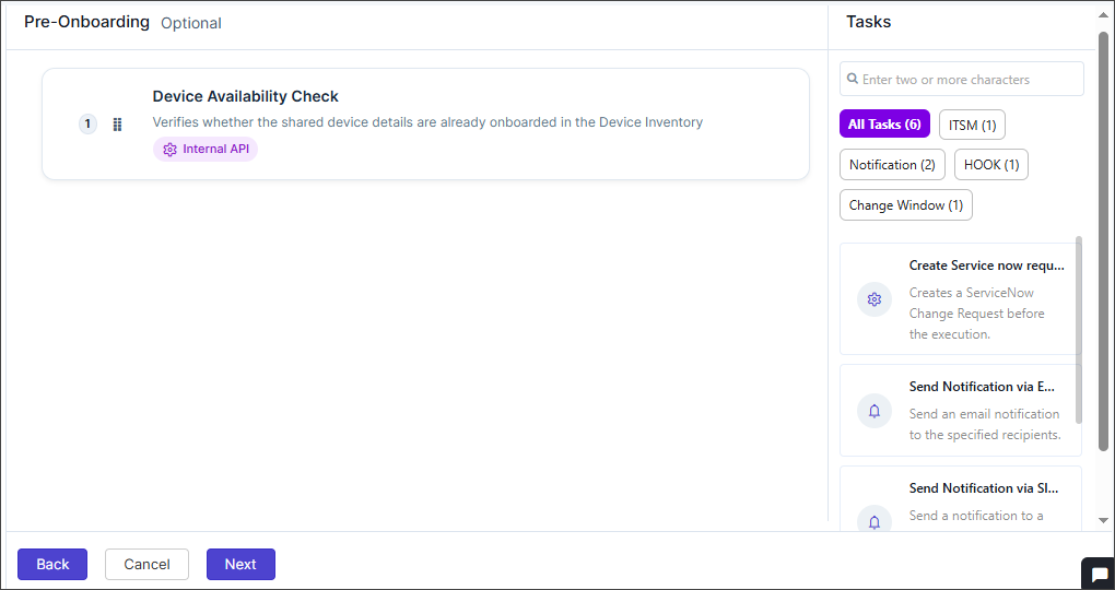
- Device Availability Check - Verifies whether the shared device details are already onboarded in the Device Inventory
- ITSM - Create a ServiceNow Change Request before the execution.
- Notifications
- Send Notification via Email - Send an email notification to the specified recipients.
- Send Notification via Slack - Send a notification to a Slack channel using the configured webhook URL.
- Hook Execution - Initiates the execution of the selected hook.
- Configure Change Window - Allows users to configure a change window during which the policy tasks should be executed.
To proceed with the pre-onboarding,
- Click Device Availability Check to check if the IP address of the device being onboarded is available with the vendor or not, else onboarding will fail. (This option is selected by default).
-
[Optional] Define additional tasks that run after the main action
completes by clicking any of the tasks appearing on the right panel.
Each task will have a separate configuration pop-up to fill out the details. See the sections below for detailed steps.
- [Optional] Complete the configurations for the required tasks and click Confirm on the respective pop-up.
-
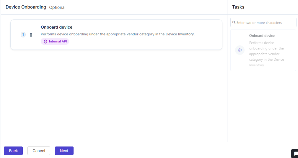
Click Next.
The fifth step, the Device Onboarding page is displayed.
ITSM - Create a ServiceNow Change Request
| Field | Description |
|---|---|
| Configuration tab | |
| Configuration tab - ServiceNow Instance | |
| Configure ServiceNow Instance | Select or configure the type of ServiceNow instance. |
| Configuration tab - Change Request Fields | |
| Type | Defines the type of ServiceNow request to be created (For example: Normal, Emergency, Standard). Select the value from the dropdown. |
| Priority | Specifies the urgency level or importance of the change request. Select the value from the dropdown (1-Critical, 2-High, 3-Moderate, 4-Low). |
| Short Description | A brief summary or title describing the purpose of the change request. |
| Description | A detailed explanation of the change request, including context or justification. |
| Category | Classifies the change under a specific functional or operational category. |
| Risk | Select the potential risk level associated with implementing the change. Select the value from the dropdown (VeryHigh, High, Moderate, Low, None). |
| Impact | Specifies the extent to which the change might affect users, services, or infrastructure. Select the value from the dropdown (1-High, 2-Medium, 3-Low). |
| Urgency | Reflects how quickly the change needs to be addressed or implemented. Select the value from the dropdown (1-High, 2-Medium, 3-Low). |
| Assignment Group | The ServiceNow group responsible for reviewing and implementing the change. |
| CAB Required | Specifies whether the change requires approval from the Change Advisory Board (CAB). Select value True or False. |
| Wait for State Change | Determines whether AppViewX should pause workflow execution until the ServiceNow change request reaches a specific state. Select value True or False. |
| General Settings tab (Configure general execution settings for this task) | |
| Continue On Failure | Determines whether the policy execution should complete even after the task fails. The toggle button is disabled by default. |
| *: Mandatory field | |
option on
the top-right of the pop-up. Variables can be inserted into text content and
at runtime, they are replaced with actual values.Notifications - Send Notification via Email
| Field | Description |
|---|---|
| Configuration tab | |
| *Recipient Type | Select either or all of the following:
|
| *User Group | This field is enabled when Recipient Type = User
Group. Select single or multiple user groups. |
| *User | This field is enabled when Recipient Type = User Select single or multiple users. |
| This field is enabled when Recipient Type =
Email. Enter a valid email address. Use either comma-separated email IDs, or a single variable like ${template_email}. |
|
| *Template Name | Select the email template name. |
| *Email Subject | This field is enabled when Notify Via = Email. Enter the subject for the email. Use the Variables option to add database values as variables. |
| *Message Content | Enter the message content for the email or slack. Use the Variables option to add database values as variables. |
| General Settings tab (Configure general execution settings for this task) | |
| Continue On Failure | Determines whether the policy execution should complete even after the task fails. The toggle button is disabled by default. |
| *: Mandatory field | |
option on
the top-right of the pop-up. Variables can be inserted into text content and
at runtime, they are replaced with actual values.Notifications - Send Notification via Slack
| Field | Description |
|---|---|
| Configuration tab | |
| *Slack Channel | This field is enabled when Notify Via = Slack. Select the slack channel. |
| *Message Content | Enter the message content for the email or slack. Use the Variables option to add database values as variables. |
| General Settings tab (Configure general execution settings for this task) | |
| Continue On Failure | Determines whether the policy execution should complete even after the task fails. The toggle button is disabled by default. |
| *: Mandatory field | |
option on
the top-right of the pop-up. Variables can be inserted into text content and
at runtime, they are replaced with actual values.Hook Execution
| Field | Description |
|---|---|
| Configuration tab | |
| Configuration tab - Hook (Select a hook from the available inventory that you want to execute.) | |
| Task Name | Displays the default name of the task (Hook Execution). You can rename it if needed for clarity in the workflow. |
| Select Hook | Choose the specific hook (script or API integration) to be executed within the workflow. |
| Configuration tab - Expose Variables | |
| Do you want to expose hook response as variables for following tasks? | Toggle this option to expose the hook’s response as
variables for use in subsequent workflow tasks. Enables or disables the ability to pass hook output values as input variables to later tasks in the workflow. |
| Output Variable Mapping | Map output variables from the hook response to custom
keys for easier reference in subsequent tasks. Paste the
expected JSON response from the hook to view and select
available variables. Fields:
 button.
 |
| Expected Response Format | Paste a sample JSON response from the hook in the
output {} section. This helps AppViewX
identify available response parameters for variable mapping
and validation. |
| General Settings tab (Configure general execution settings for this task) | |
| Continue On Failure | Determines whether the policy execution should complete even after the task fails. The toggle button is disabled by default. |
| *: Mandatory field | |
option on
the top-right of the pop-up. Variables can be inserted into text content and
at runtime, they are replaced with actual values.Configuring Change Window
This page allows users to define a specific change window a scheduled timeframe during which policy-related tasks can be executed.
| Field | Description |
|---|---|
| Configuration tab | |
| Change Window Configuration | Configure when policy changes are allowed to run. Use the Preview Windows option to visualize the scheduled change windows based on the selected configuration. |
| *Mode Selection | Choose the frequency or recurrence pattern for the change
window. The options available are as follows:
|
| Daily Schedule Settings | This section is enabled when Mode Selection =
Daily. Enter the values in the following
fields:
|
| Weekly Schedule Settings | This section is enabled when Mode Selection =
Weekly. Enter the values in the following
fields:
|
| Monthly Schedule Settings | This section is enabled when Mode Selection =
Monthly. Enter the values in the following
fields:
|
| Custom Date & Time | This section is enabled when Mode Selection = User
Defined. Enter the values in the following
fields:
|
| *Missed Window Policy | Determines the system behavior if a task misses its
scheduled change window. Options include:
|
| Allow Override | Enables authorized users or groups to allow execution outside the defined change window. |
| Override Type | This field is enabled when Allow Override toggle
is enabled. Select from User Group or User. |
| User Group | This field is enabled when Allow Override toggle
is enabled and Override Type = User Group Select User Group from the dropdown. |
| User | This field is enabled when Allow Override toggle
is enabled and Override Type = User Select User from the dropdown. |
| General Settings tab (Configure general execution settings for this task) | |
| Continue On Failure | Determines whether the policy execution should complete even after the task fails. The toggle button is disabled by default. |
| *: Mandatory field | |
option on
the top-right of the pop-up. Variables can be inserted into text content and
at runtime, they are replaced with actual values.Onboarding Device
- Click the Next button to move to the next step, Post-Onboarding.
Configuring Post-Onboarding Tasks
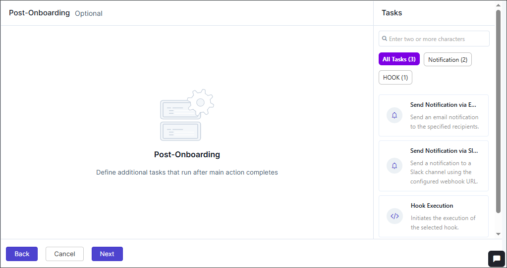
Configuring Email Notifications
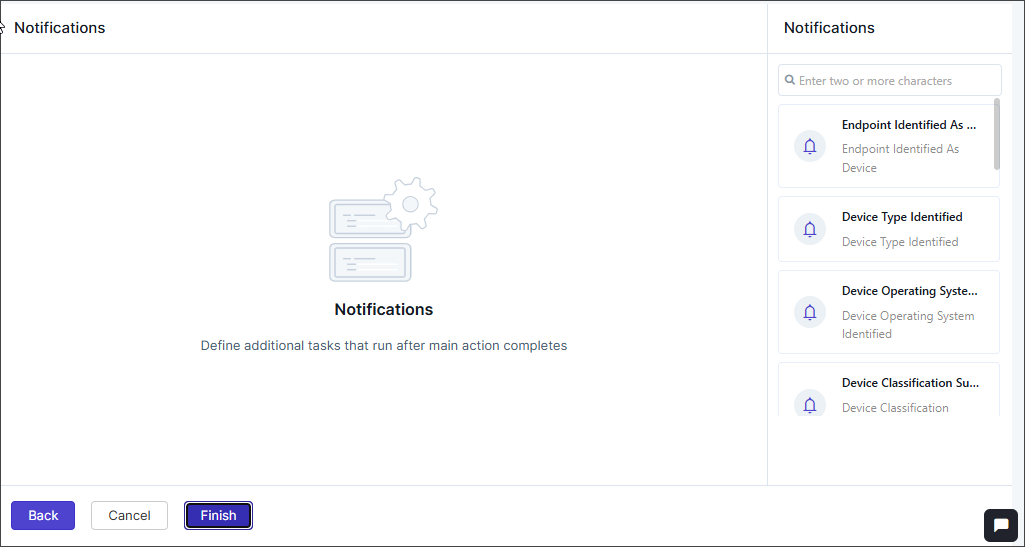
- Endpoint Identified As Device
- Device Type Identified
- Device Operating System Identified
- Device Classification Success
To configure any of the above emails,
-
From the notification panel on the right, click any of the specific emails
to be configured. The <email_name> pop-up is displayed.
The <email_name> pop-up is displayed.Note: All the email templates have the same fields, see to the table below to configure any of the emails.
-
Enter the following details in the email configuration pop-up.
Field Description *Notify Via Select from the following: - Slack
*Recipient Type This field is enabled when Notify Via = Email. Select either or all of the following:
- User Group
- User
*Slack Channel This field is enabled when Notify Via = Slack. Select the slack channel.
*User Group This field is enabled when Notify Via = Email and Recipient Type = User Group. Select single or multiple user groups.
*User This field is enabled when Notify Via = Email and Recipient Type = User Select single or multiple users.
*Email This field is enabled when Notify Via = Email and Recipient Type = User Email. Enter a valid email address. Use either comma-separated email IDs, or a single variable like ${template_email}.
*Template Name This field is enabled when Notify Via = Email. Select the email template name.
*Email Subject This field is enabled when Notify Via = Email. Enter the subject for the email. Use the Variables option to add database values as variables.
*Message Content Enter the message content for the email or slack. Use the Variables option to add database values as variables. *: Mandatory field Note: Users can copy predefined variables (e.g., ${user.firstName}, ${user.lastName}) from theoption
on the top-right of the pop-up. Variables can be inserted into text
content and at runtime, they are replaced with actual values. -
Click Add.
The email templates are created successfully.
- Click Finish at the bottom of the screen to complete the device policy creation.